PureBreed Dog Treats
Tasty treats for dogs
Visual identity
The brief
PureBreed required new packaging for a growing range of dog treats that would strengthen brand identity, differentiate flavours clearly, and establish a consistent system for future product extensions.
The project
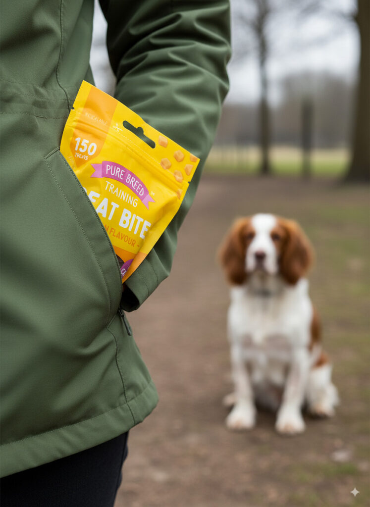
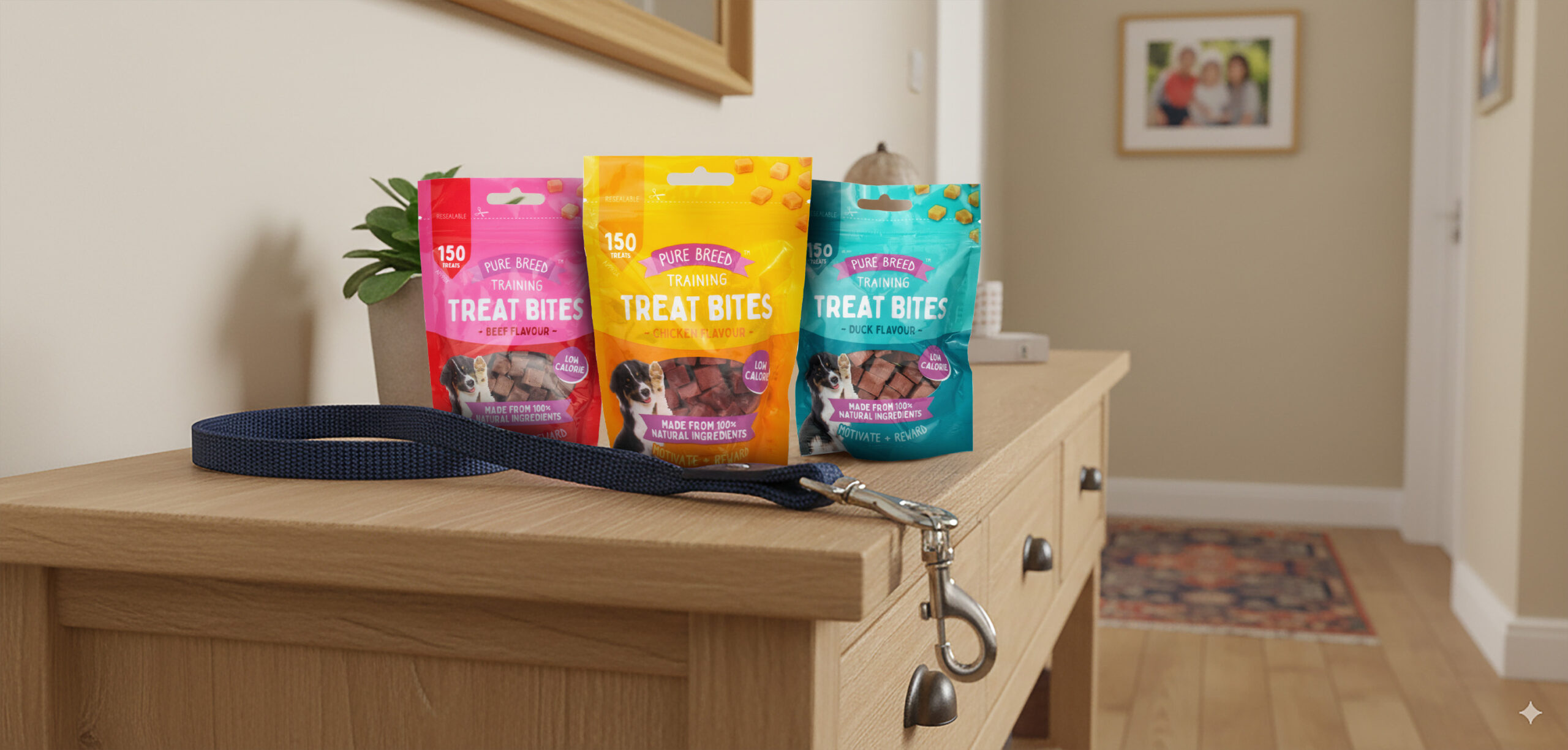
Working closely with the pet food buyer, I developed the visual identity and packaging system for the Pure Breed dog treat range. The goal was to create a cohesive brand look while making it simple for shoppers to distinguish between flavours and product types.
Market research into competitor packaging and consumer preferences informed the direction, which led to the introduction of a consistent colour coded system – teal for duck, yellow for chicken, pink for beef, ensuring each flavour felt distinct while still part of a unified family.
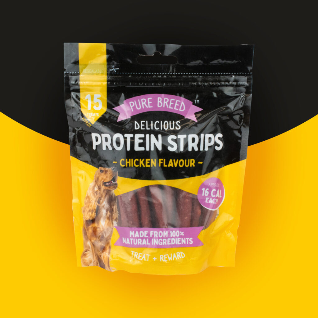
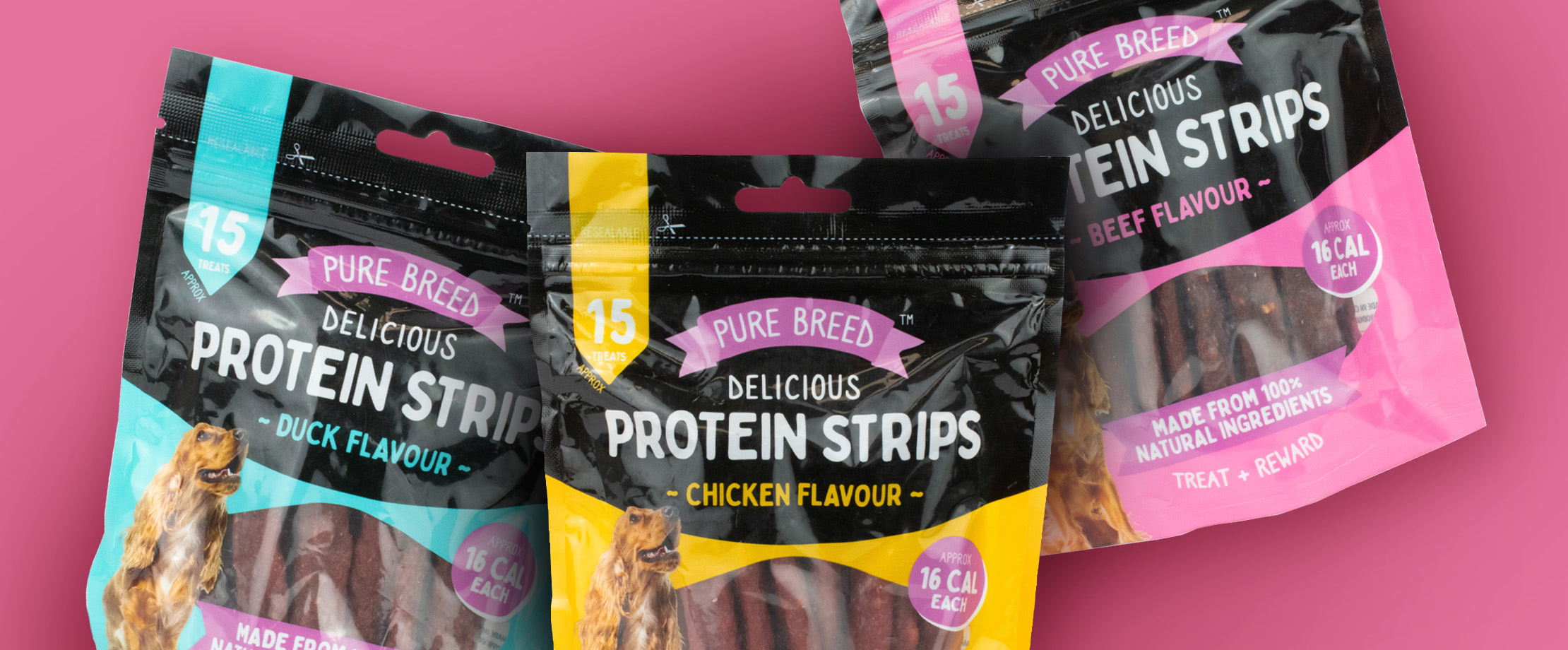
When designing Protein Strips, I expanded the system by adding a bold black upper section, giving the packs a premium edge and differentiating them from the Training Treat Bites. Typography, colour, and imagery were carefully balanced to communicate quality and flavour while enhancing shelf impact.
The final range delivered a refreshed, engaging look that improved brand presence, shopper clarity, and retail confidence. The Protein Strips launch in particular exceeded expectations, receiving excellent retailer feedback for its standout design.