Work
SecureFix Adhesives
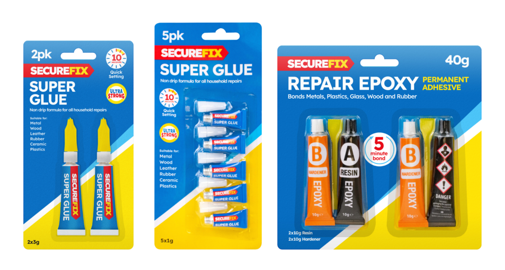
SecureFix is a brand specialising in adhesive tapes and glues, where clear communication of product features is key to guiding customers to the right solution. The challenge was to refresh the brand’s visual identity, making it bolder, more modern, and easier to navigate on-shelf.
A crucial part of this refresh was standardising symbols and icons across the range. By developing a clear, uniform system of icons, I ensured that product features—such as water resistance, high strength, and flexibility—were instantly recognisable. This approach not only enhanced clarity for customers but also created a more professional and cohesive look across all packaging.
In addition to improving usability, I focused on bold, striking design choices to make the brand more impactful. Strong typography, high-contrast colours, and clean layouts were introduced to ensure SecureFix products stood out in a competitive retail environment.
This refresh successfully positioned SecureFix as a modern, reliable, and easy-to-shop brand, making it simpler for customers to identify the right adhesive solution at a glance.