Work
mktWorks Identity
mktWorks is a consultancy focused on helping established B2B businesses successfully transition into B2C and D2C markets.

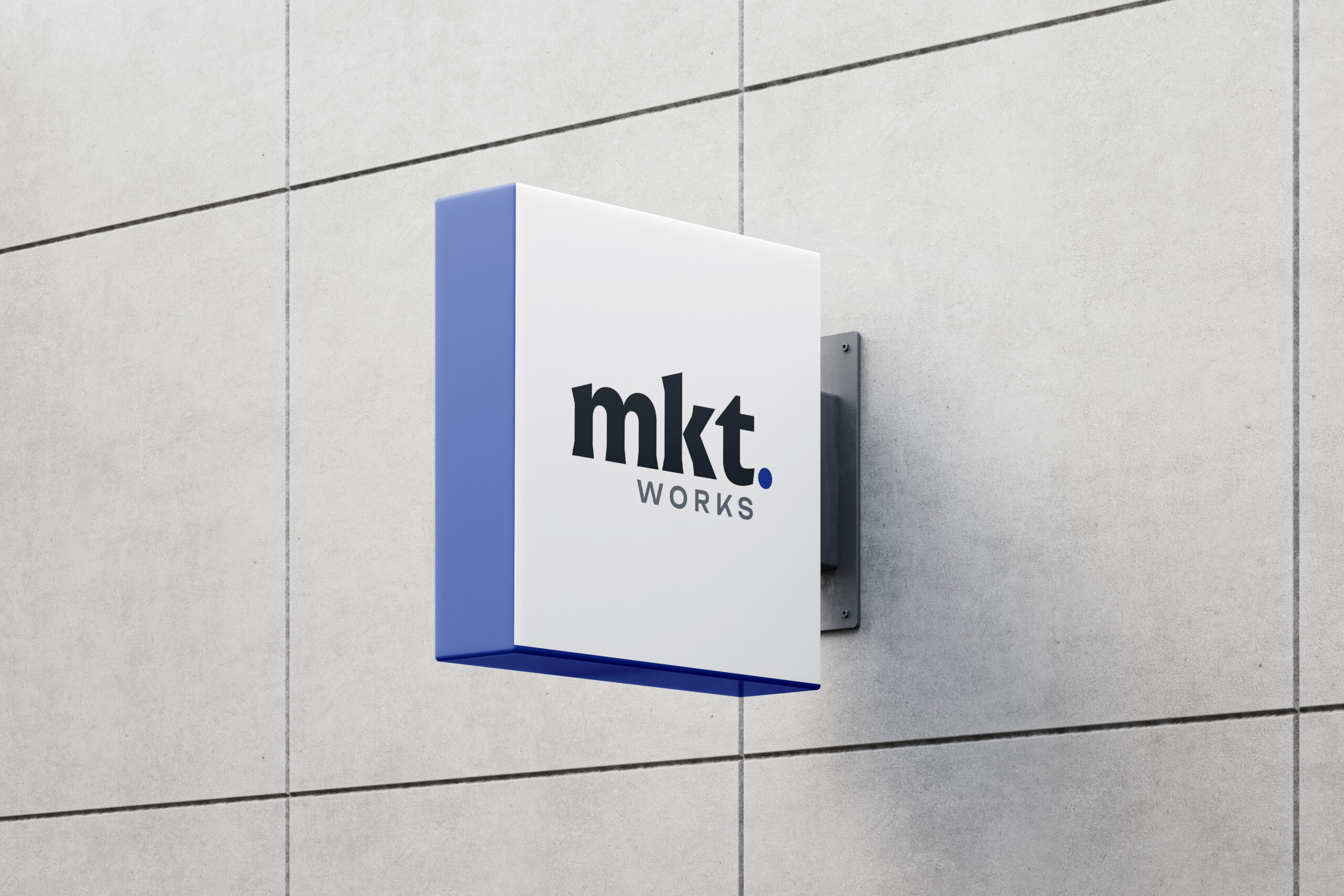
Although briefed in all caps, the first design choice I made was to present “mkt” in lowercase bold serif typeface. Using lowercase for “mkt” helped clarify that “mkt” is an abbreviation of “market” and not an initialism. The serif typeface also serves to establish a credible, mature brand presence.
I chose to pair the serif typeface with a modern sans serif to reflect the brand’s objective, which involves transforming legacy B2B expertise into modern B2C success online.
I positioned the tagline so that the word “scale” aligned with the full stop. This was done to emphasise the main focus of mktWorks, which is growing their client’s business. The full stop was utilised to emphasise the total and complete service offered by mktWorks.
The color palette I selected blends confidence, refinement, and innovation, resulting in a clean, strategic, and impactful logo.
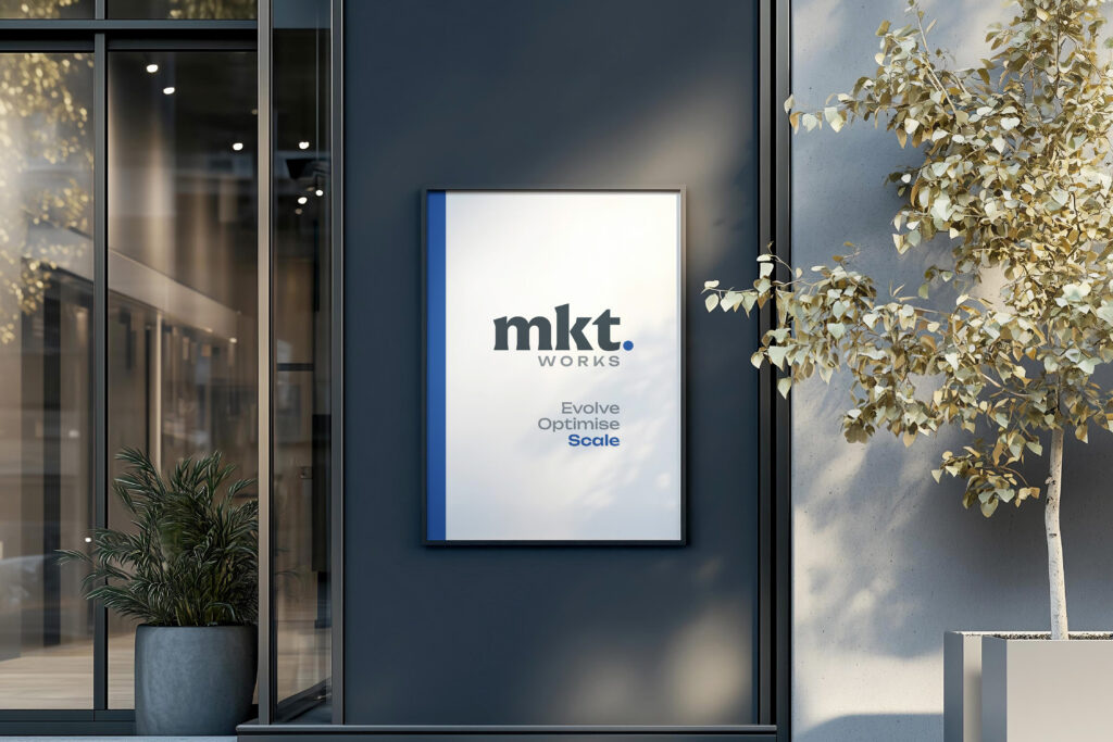
I selected the typeface “Unbounded” as the sans serif used in the logo and as the typeface to be used in additional marketing collateral. As a modern sans-serif typeface with unique visual interest (notably, the angled ascenders on some characters) it provided a contemporary edge to the visual identity of mktWorks.
