Bloome Air Care
Elevating air care
Logo design • Visual identity
The brief
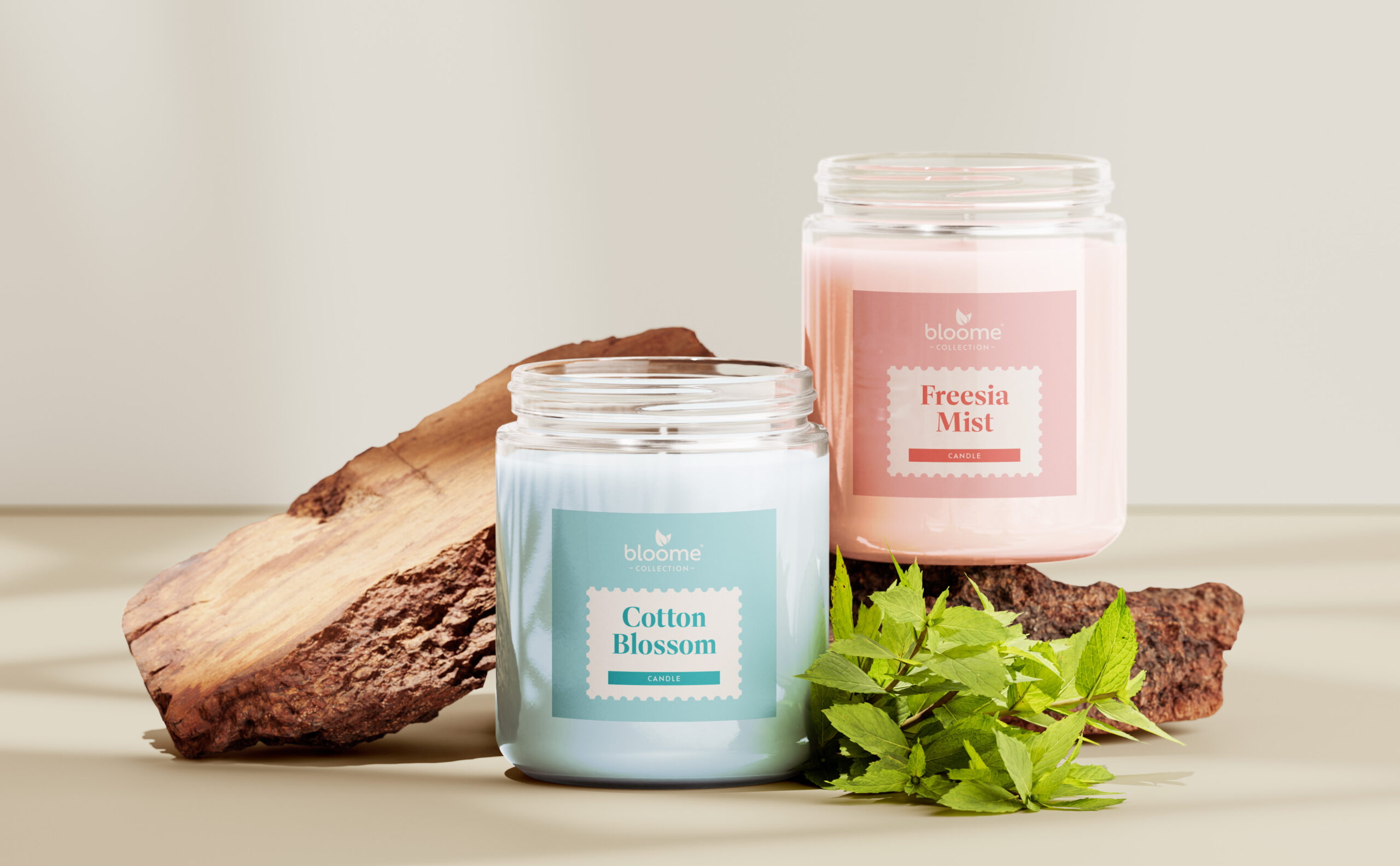
The existing candle and air care range had become fragmented due to multiple range updates, resulting in a lack of visual consistency. The objective was to develop a cohesive and unified visual identity for the FMCG air care offering, prioritising clarity, brand recognition, and stronger shelf presence.

The project
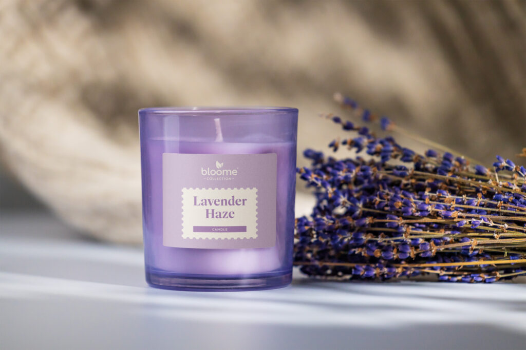
With air fresheners and candles often being two distinct retail propositions, the decision was made to divide the Bloome range in to two visual identities whilst still maintaining a consistent logo across both.
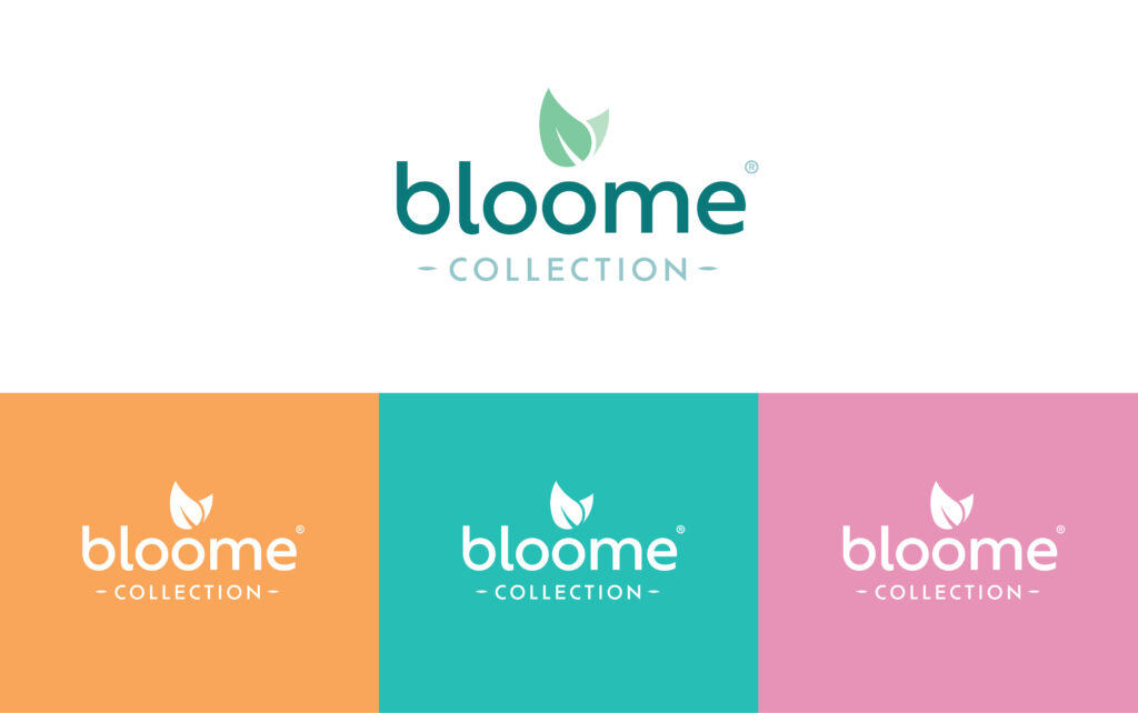
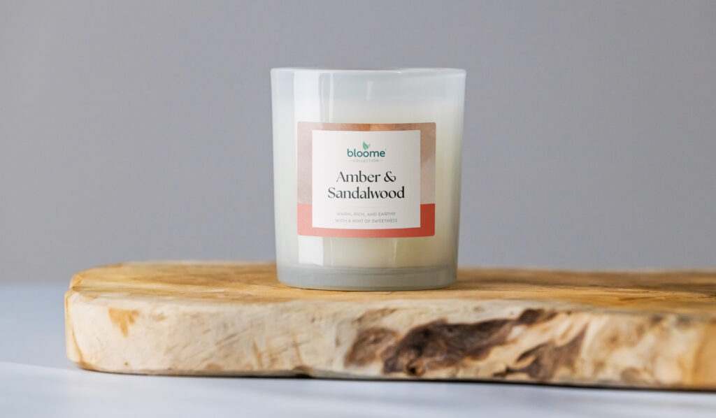
The solution included a refreshed brand logo that balanced simplicity with a sense of refinement, and a flexible packaging system designed to accommodate three distinct product tiers: functional, lifestyle, and premium.
A clear visual hierarchy was established to help consumers navigate the range with ease, while also ensuring strong shelf presence across all formats.


