Develop a new brand identity and pack design for a range of cat treats.
Overview
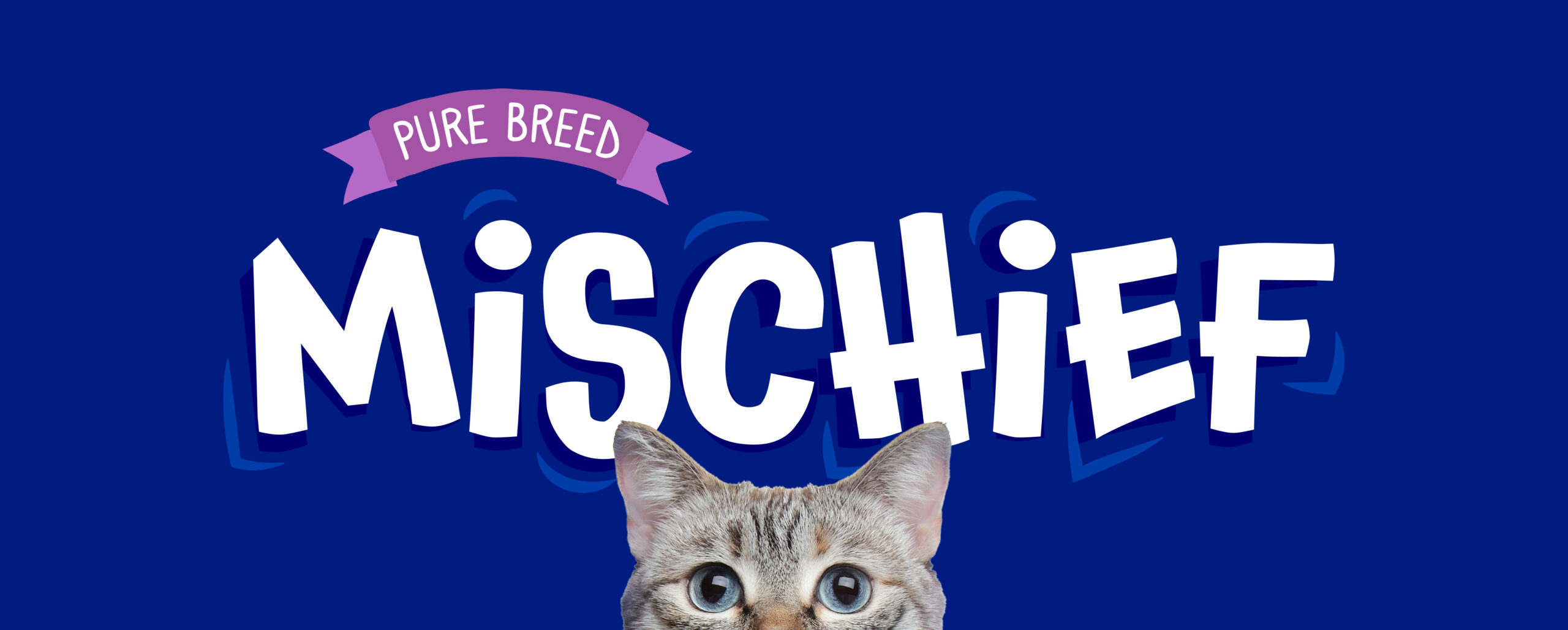
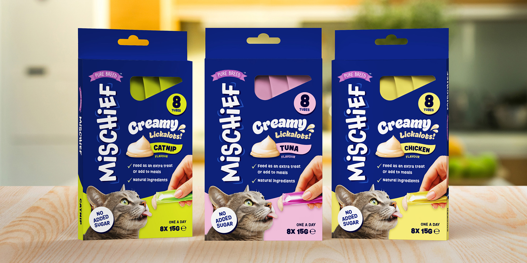
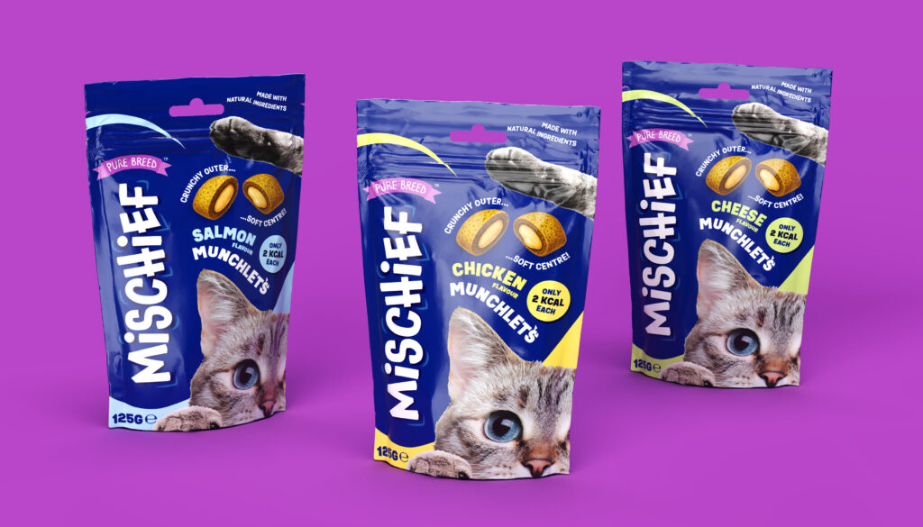
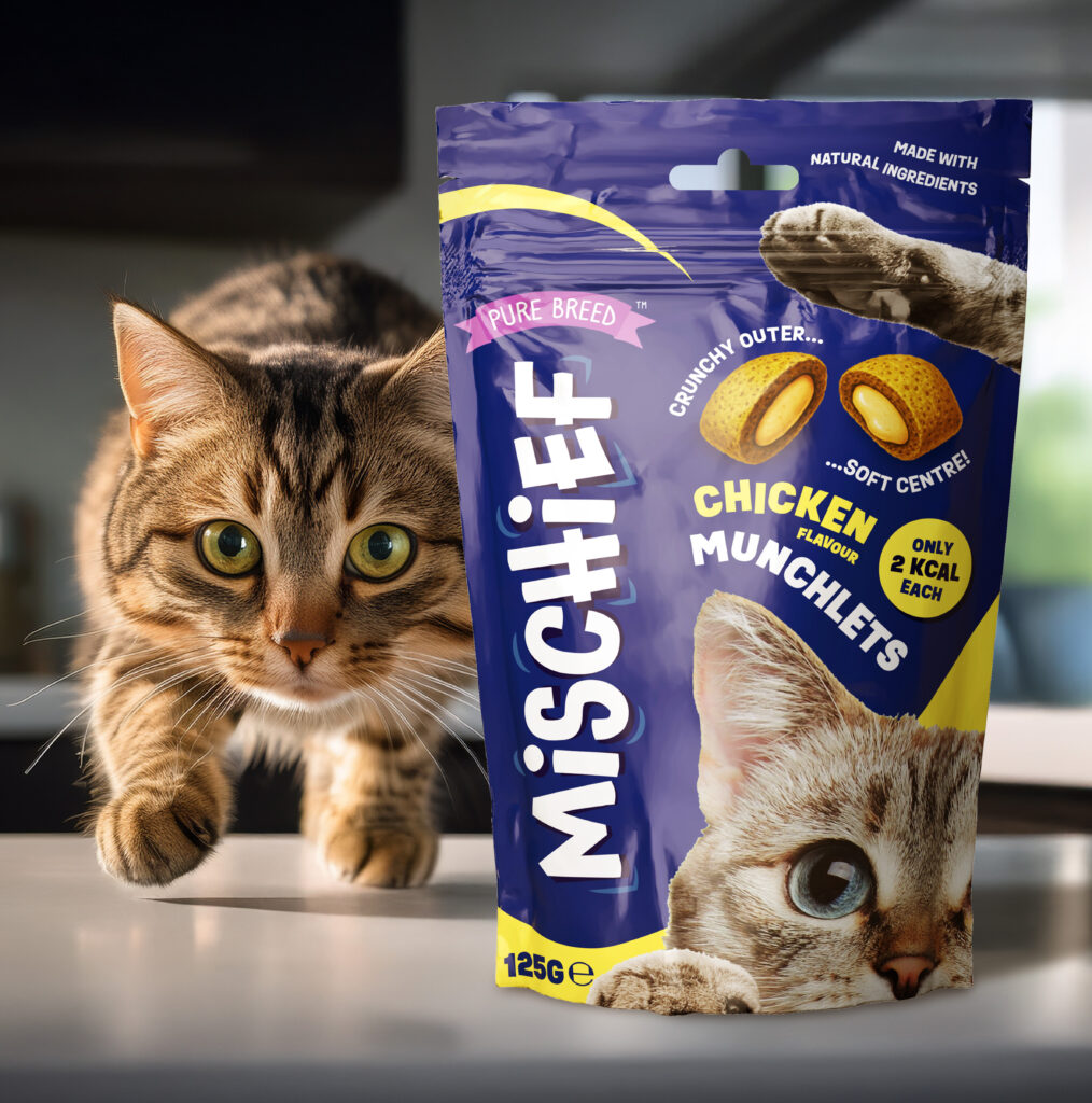
Research showed the need for a fresh, playful sub-brand, leading to the name “Mischief”, capturing cats’ cheeky energy. I then began to investigate pack designs and created the product names “Munchlets” and “Lickalots” – two fun, ownable names in keeping with the theme for the sub-brand.
I led visual identity and packaging design across three flavours for each product, balancing bold shelf presence with charm. Large playful typography, imagery of a cat, and vibrant accents built instant recognition, while illustrations communicated the textures of the products.
To support sell-in, I produced high-quality 3D pack renders in Adobe Dimension, helping secure UK and European retail listings before stock landed.
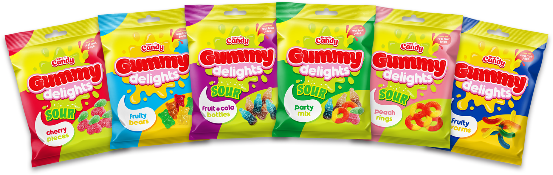
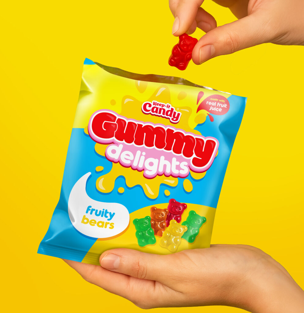
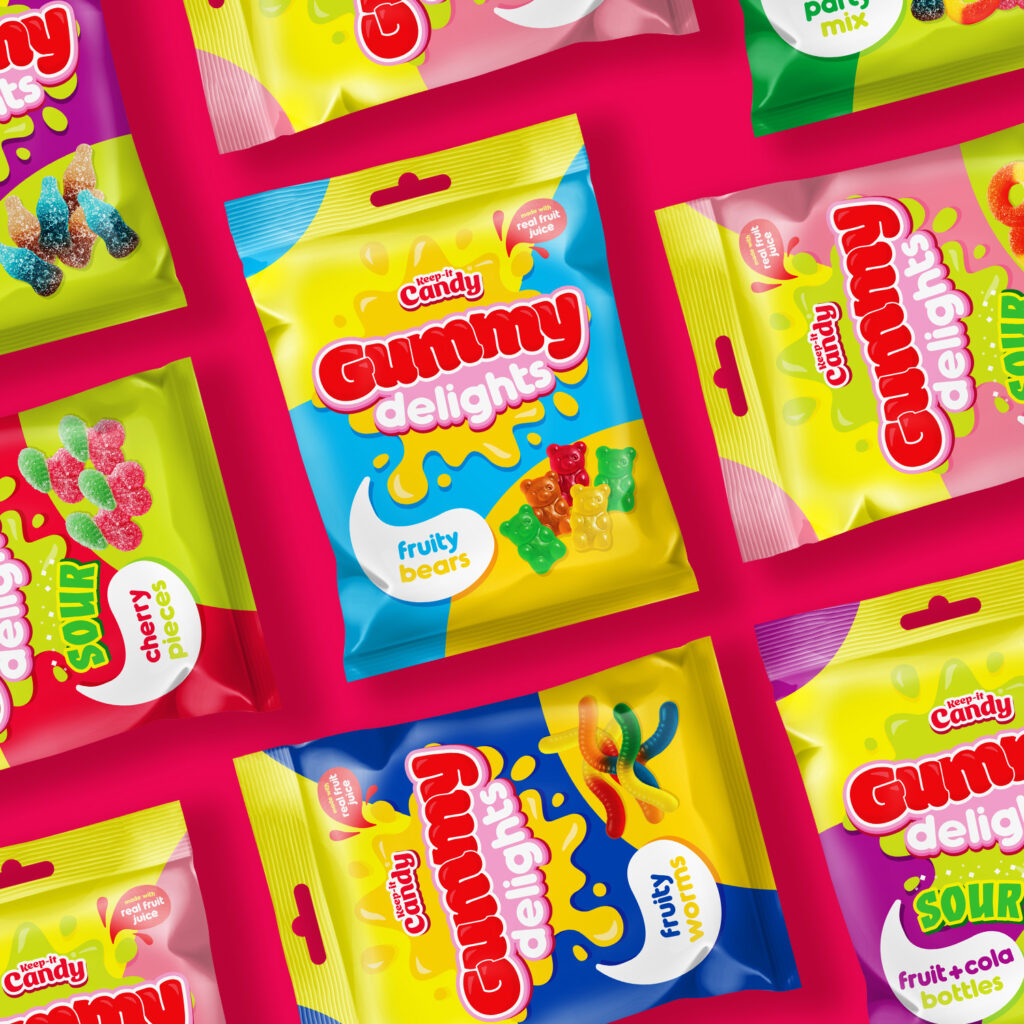
Develop a new brand identity and packaging design for a range of gummy sweets.
Overview
The first task was to refresh the logo design for the Keep-it Candy brand. The original logo lost clarity at smaller sizes, and its skewed layout made it difficult to adapt alongside future sub-brands.
To address this, I simplified the design and placed it on a subtle arc for better balance. A vibrant raspberry-red replaced the original red, giving the logo a fresher and fruitier feel. Finally, I introduced a more approachable, playful typeface to unify the updated look and strengthen the brand’s identity.
The next step was to create a design for the gummy range itself. Settling on “Gummy delights” I worked to develop a packaging style that brought clarity and strong shelf presence through bold use of colour, playful typography, and flavour cues.
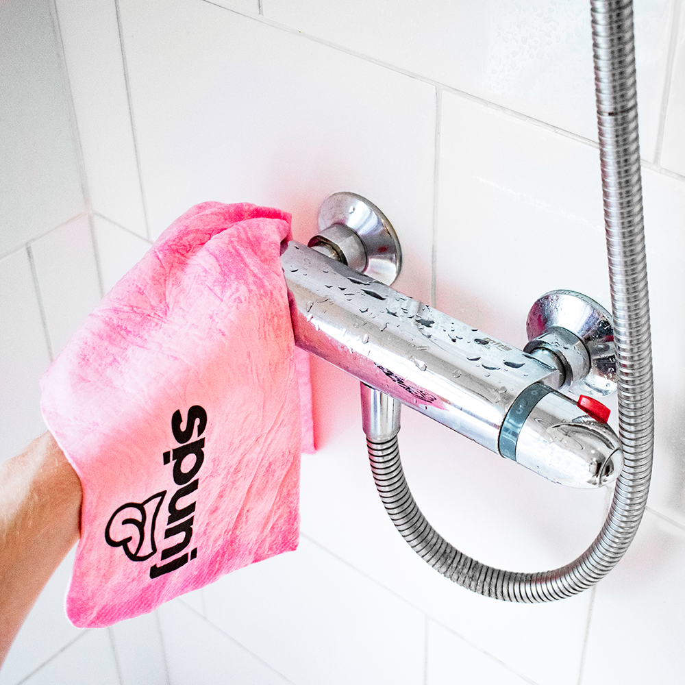
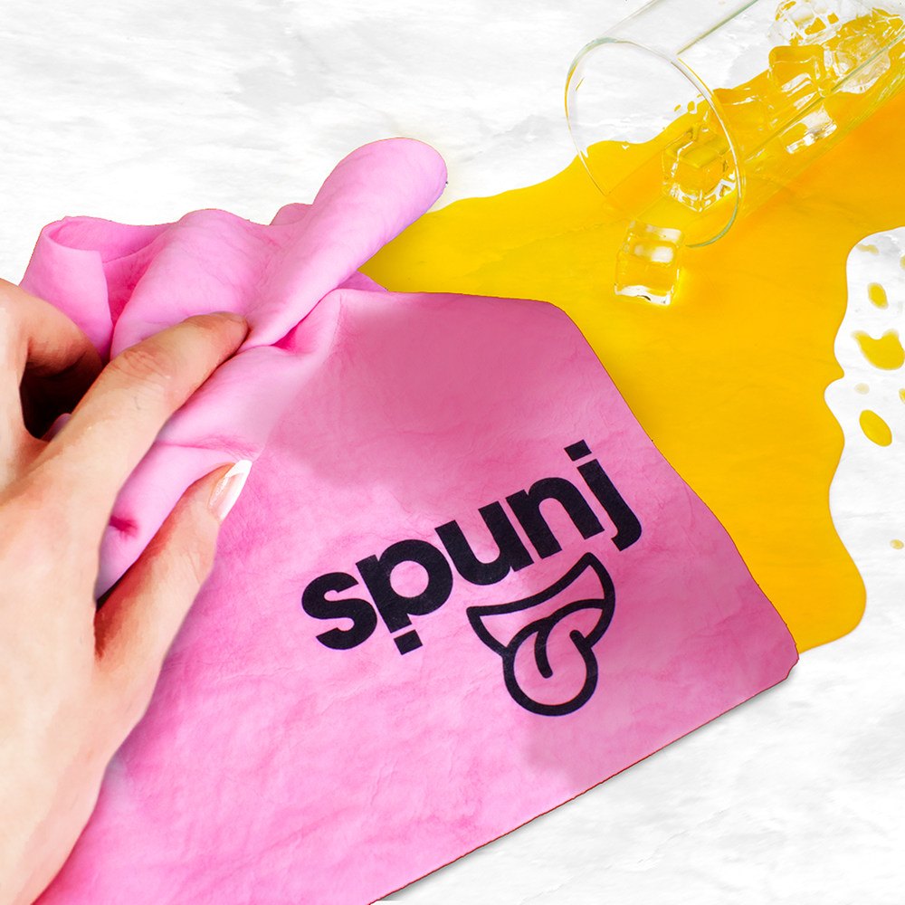
Create a new brand for a moisture absorbing cleaning cloth and sponge.
Overview
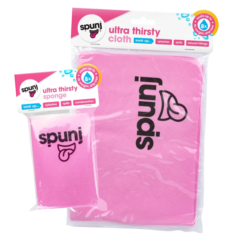
Amid the rise of “cleanfluencers” and the widely recognised Mrs Hinch effect in 2020, I was part of the team that launched Spunj – an ultra-absorbent cleaning brand designed to stand out in a crowded household category.
The core product was a highly absorbent PVA sponge capable of holding up to eight times its weight in water, combining strong performance with everyday practicality.
Working closely with the Marketing Executive and an external marketing consultant, I helped develop a comprehensive brand book for Spunj. This became a key foundation for the brand, ensuring consistency across all touchpoints – including social media, PR, retail presentations and pitch decks.
Following the finalisation of the brand guidelines, I designed the packaging artwork, translating the brand’s tone into a playful and engaging visual style. Each product variant maintained a cohesive identity while clearly communicating its key features and benefits.
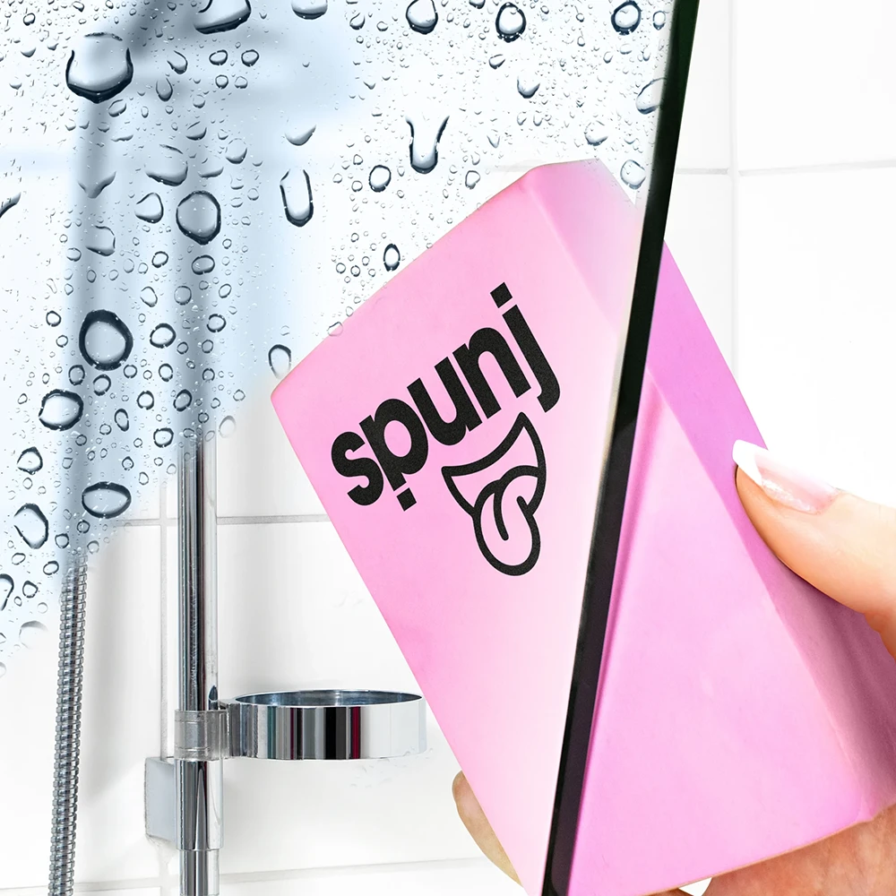
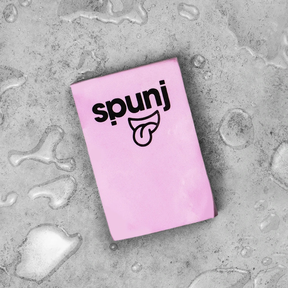
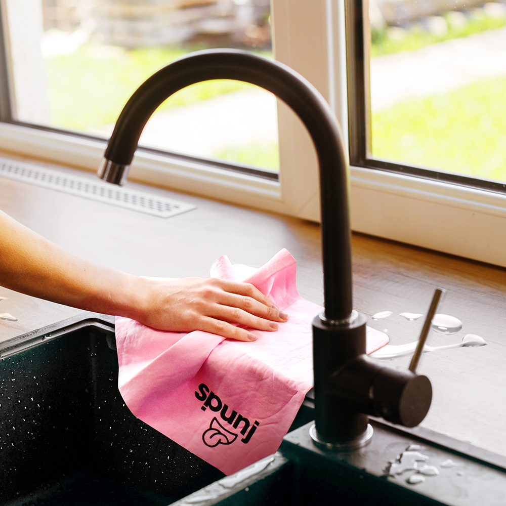
Alongside the brand and packaging work, I photographed and edited marketing imagery used across social media, point-of-sale materials and trade decks, helping establish a consistent visual style for the brand.
As a result, the launch of spunj delivered strong commercial and brand results:
1.3 million units sold
15,000 Instagram followers
Finalist – Grocer New Product Awards
Retail listings in B&M, The Range, Morrisons, Aldi and Savers
Featured on TV on This Morning
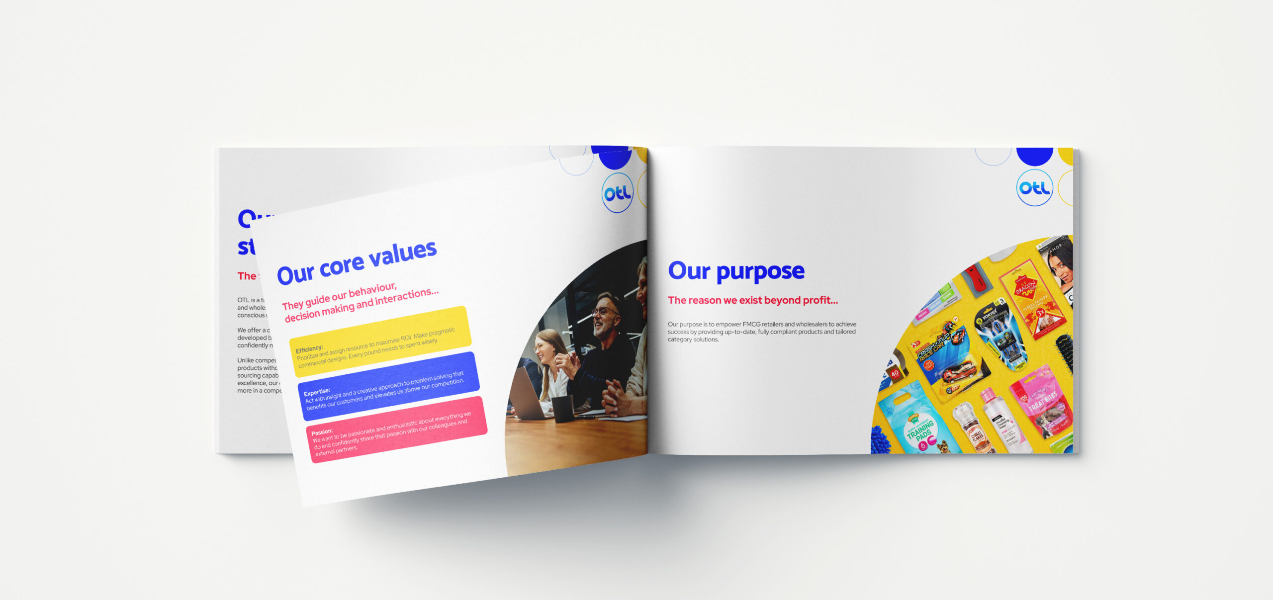
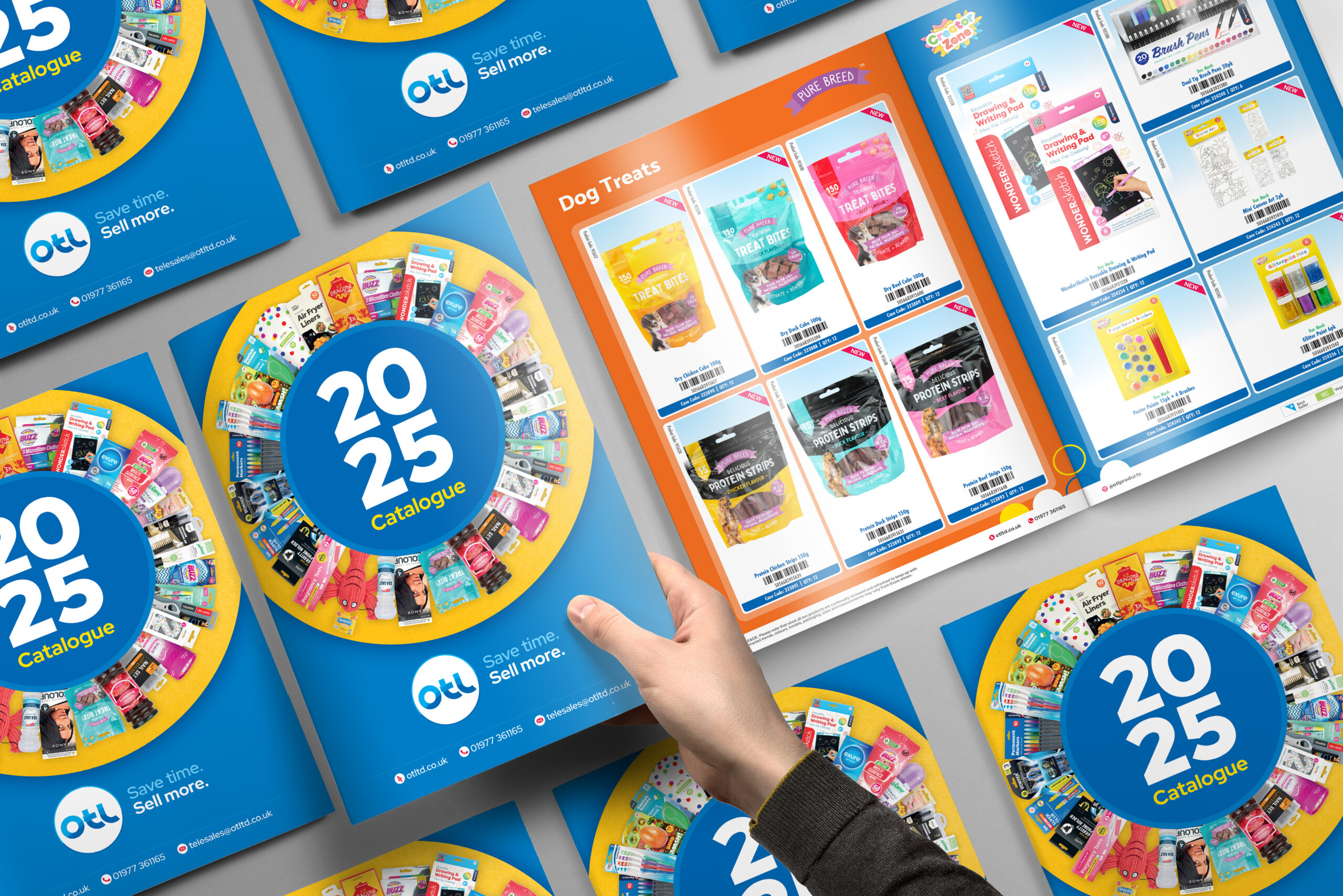
Create a modern new look and accompanying brand framework that brings OTL in to the modern era and sets it up for future growth.
Overview
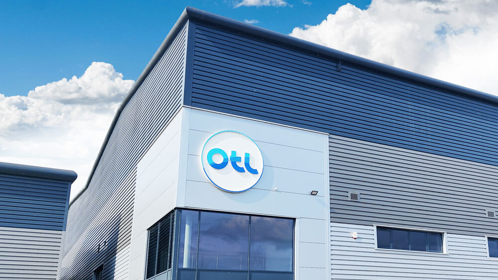
OTL’s previous logo lacked the refinement needed to represent its position as a category leader with a professional identity.
To begin the project, I conducted research into the competitive landscape and held sessions with internal stakeholders to uncover what truly set OTL apart. These insights became the foundation of OTL’s first brand book and guided the rebrand, ensuring the new identity aligned with both company goals and market expectations.
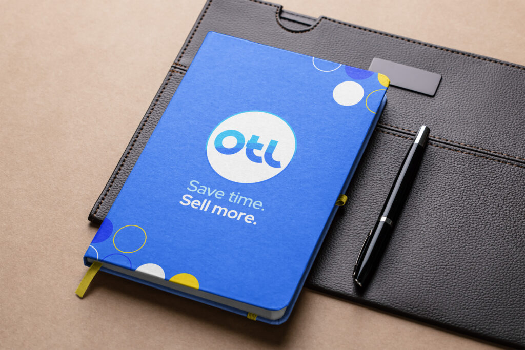
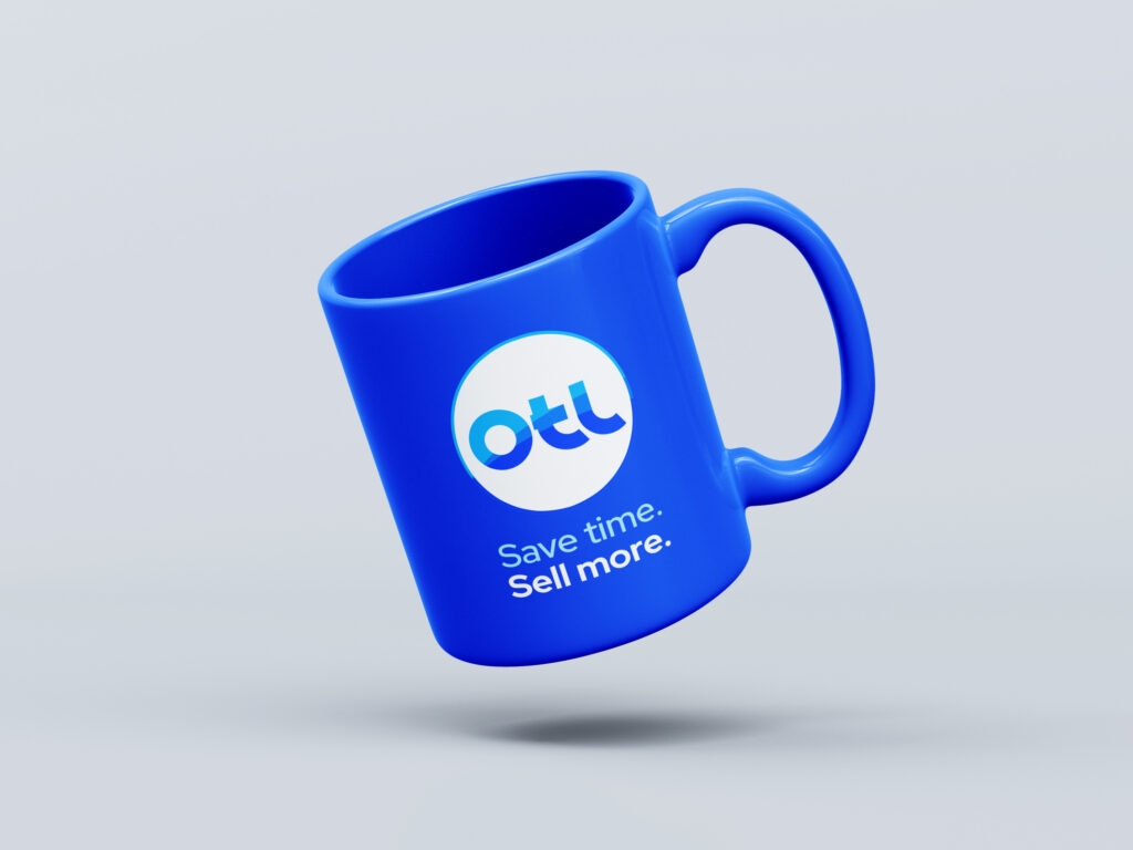
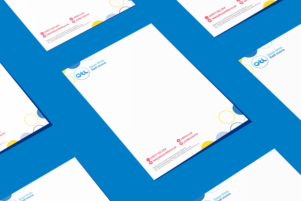
I defined the company vision, positioning statement, and core values, and created the tagline “Save time. Sell more.” – a concise expression of OTL’s mission to support retailers at both the service and product level.
With the brand foundation in place, I shifted focus to the logo and other graphic elements. The previous all caps design felt unrefined and, unintentionally, resembled an emoticon for despair – an issue made more problematic in the Far East, where OTL had the majority of its sourcing network. To address this, I developed a new lowercase logo that conveyed OTL’s forward-looking strategy while presenting a more approachable and contemporary identity. An accompanying graphic element constructed from an arrangement of circles served to create further recognisable visual elements for the company.
With the framework and logo in place, I presented the new brand identity to the Board of Directors for approval. After sign-off, I produced printed brand booklets and style guides to support the internal rollout, giving employees a practical reference for maintaining consistency across customer interactions and marketing materials.
The project strengthened OTL’s brand identity and established a solid foundation for future growth, ensuring a unified and forward-looking message across every touchpoint.
You’ve done a brilliant job from start to finish on the OTL rebrand and bringing it to this point. You are innovating whilst carefully considering the content, meaning and positioning of your concepts and thoughts. You have the gravitas and intelligence to be an integral part of our culture change program and I would see you as a shoe in for a cultural architect.
Managing Director, OTL
Previous logo
Create a visual identity for Bloome’s new mist diffuser that focusses on the wellness aspects of aromatherapy.
Overview
Bloome, an established FMCG air freshener and candle brand, was expanding its offering with a new mist diffuser that marked a shift in the brand’s usual price point – moving from predominantly £1 items to a higher value £8 segment.
The key challenge was differentiation, whilst most competitors focused on integrated LEDs or run-time, but we wanted to highlight wellbeing and lifestyle benefits. The diffuser needed to feel aspirational, provide tangible value and call out our dual fragrance oils, whilst feeling like it could fit seamlessly into a user’s home and daily routine.
To bring the Bloome mist diffuser to life, I created artwork that positioned the product within a more considered, wellbeing-led space for the range.
The visual direction focused on calm, lifestyle integration, and a sense of ease, expressed through a soft colour palette and watercolour accents tied to each fragrance. This approach helped establish a serene tone and distinguished the product from competitors who largely prioritised functional features and technical aspects.
The QR code on pack directs users to a product video, extending the retail experience beyond the shelf and creating a more immersive connection with the brand. To produce this, I generated 3D renders from Illustrator models, refined them in Adobe Dimension, and then brought everything into After Effects. There, I combined animation with stock footage, voiceover, and text overlays to communicate the product’s wellbeing-led positioning – all while working within the brand’s budget constraints.
The result was a promotional video that elevated the product above its competitors, clearly expressed its wellness benefits, and helped the Bloome brand transition confidently into a higher-value area of the market.
In addition to the packaging and product visuals, I oversaw the creation of AI-enhanced multimedia assets to support the Bloome sales team when presenting to distribution partners. To stay within budget, photography of the Wellness Pod was captured in-house and then elevated using AI image and video generation. This allowed us to produce polished lifestyle visuals that demonstrated how the product could integrate naturally into a user’s home, conveying its aspirational feel without relying on costly external shoots.
Create a new FMCG cleaning brand that would stand out in a crowded market and connect with the growing social media cleaning trend.
Overview
I was asked to create a new FMCG cleaning brand that would stand out in a crowded market and connect with the growing social media cleaning trend. The visual identity needed to be modern, approachable, and engaging, with a strong social-first feel that would appeal to trend-conscious consumers while supporting a wide product range.
Join the Cleaning Buzz was developed as a fresh, on-trend FMCG brand that would provide branded alternatives within the discount market, whilst being designed to make cleaning feel fun, quick, and engaging. The mission was to build a brand that tapped into the energy of social media cleaning communities while keeping customers connected to the latest trends and product innovations.
I developed the name ‘Join the Cleaning Buzz’ to tap in to the growing social element within cleaning and created a visual identity to reflect this dynamic approach. A speech bubble element was incorporated into the logo, symbolising the inclusivity of the cleaning community and their passion for sharing hacks an ideas.
From Anti-Bac Wipes to textured Microfibre Cloths, the visual identity was crafted to flex across a wide product range, ensuring consistency while keeping the personality bold and engaging. In order to reinforce the dynamic aspects of the brand I also generated an animated version of the brand logo for use online.
The result was a vibrant, trend-driven identity that positioned Join the Cleaning Buzz as a must-have FMCG brand within the discount cleaning aisle.
Within the Buzz range, there are a group of products that contain “Germ Shield Technology” – a long-lasting fabric protection that resists bacterial growth and keeps products cleaner and fresher for longer. As part of the identity for that sub-range I created a “Germ Shield Technology” logo, that I then went on to animate in After Effects for use in digital marketing.
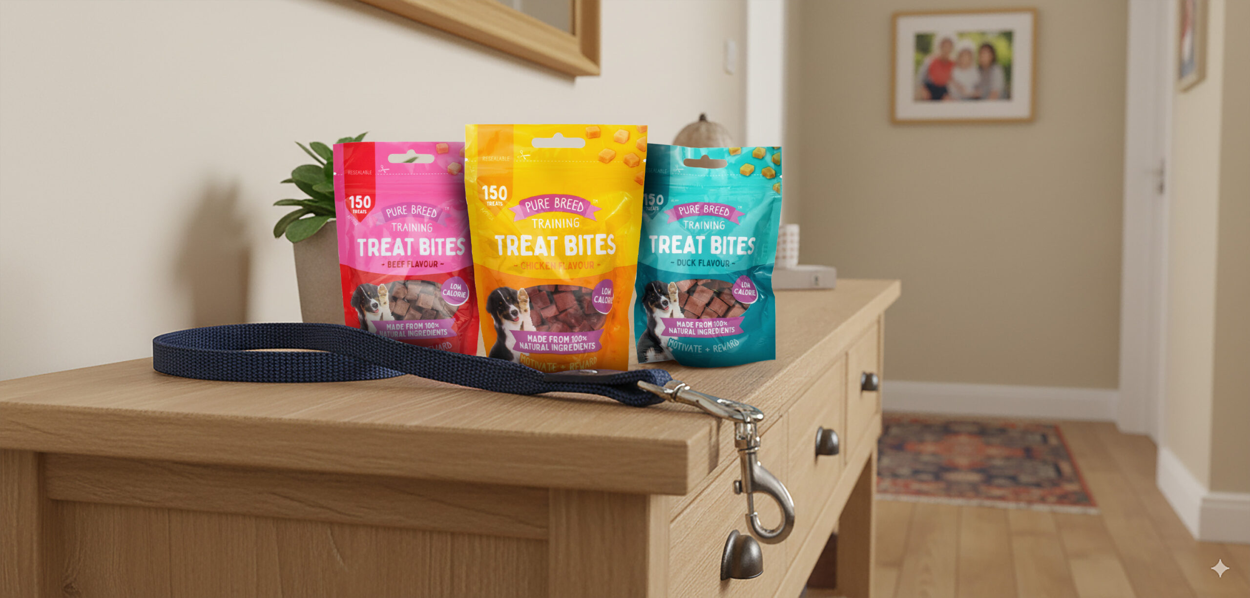
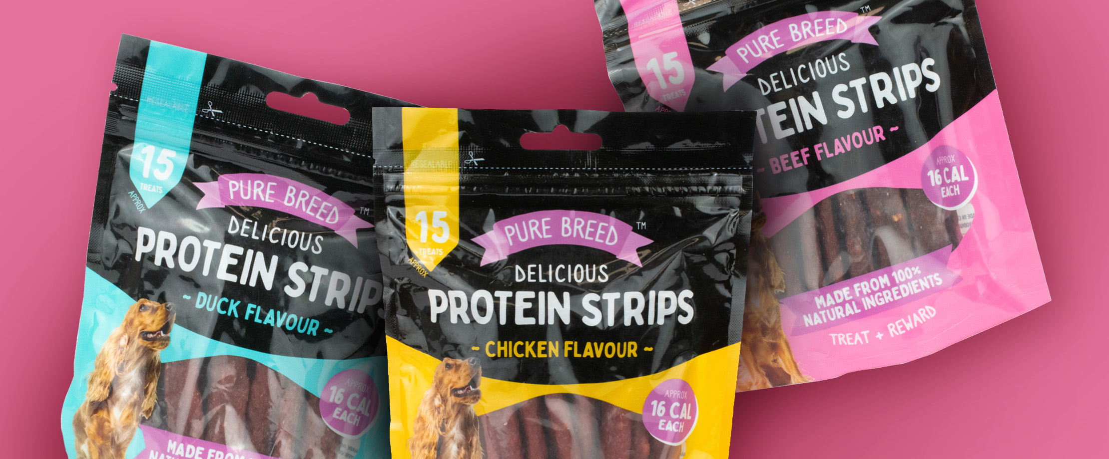
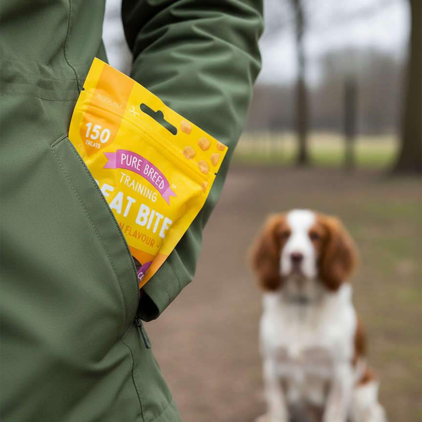
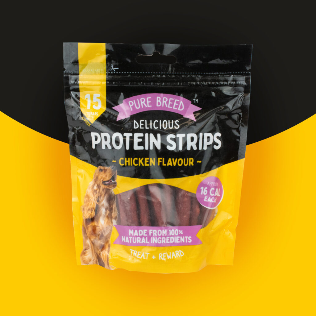
Refresh the visual identity for a growing range of dog treats.
Overview
Working closely with the pet food buyer, I developed the visual identity and packaging system for the Pure Breed dog treat range. The goal was to create a cohesive brand look while making it simple for shoppers to distinguish between flavours and product types.
Market research into competitor packaging and consumer preferences informed the direction, which led to the introduction of a consistent colour coded system – teal for duck, yellow for chicken, pink for beef, ensuring each flavour felt distinct while still part of a unified family.
When designing Protein Strips, I expanded the system by adding a bold black upper section, giving the packs a premium edge and differentiating them from the Training Treat Bites. Typography, colour, and imagery were carefully balanced to communicate quality and flavour while enhancing shelf impact.
The final range delivered a refreshed, engaging look that improved brand presence, shopper clarity, and retail confidence. The Protein Strips launch in particular exceeded expectations, receiving excellent retailer feedback for its standout design.
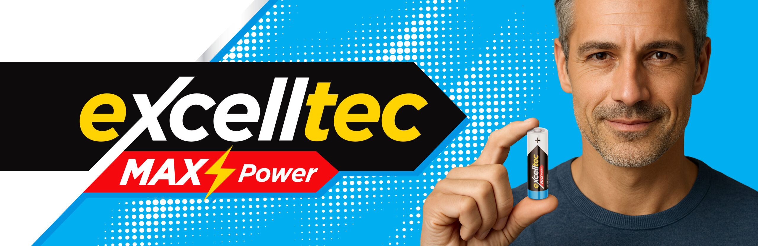
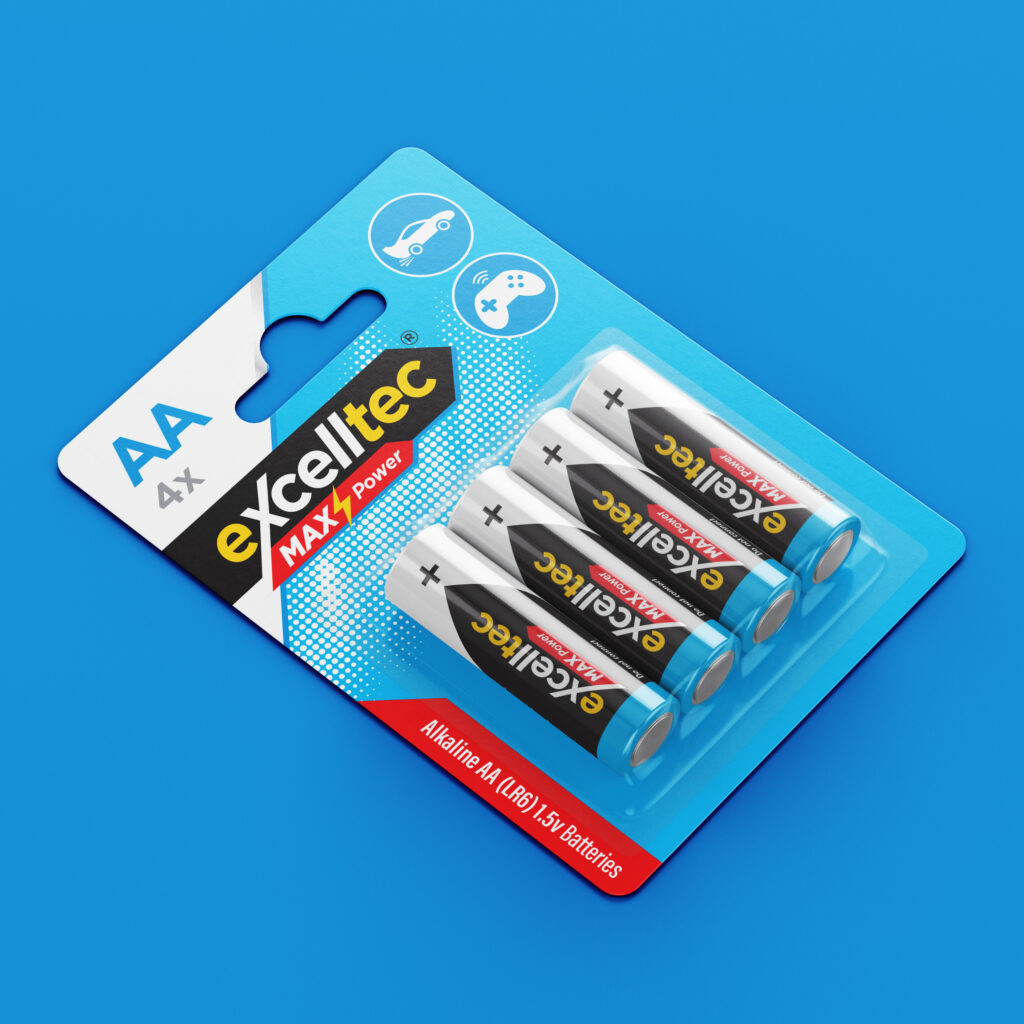
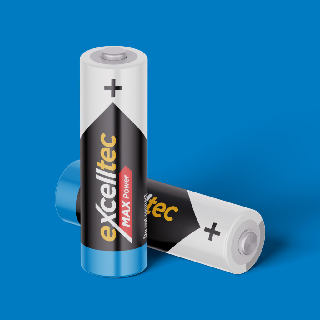
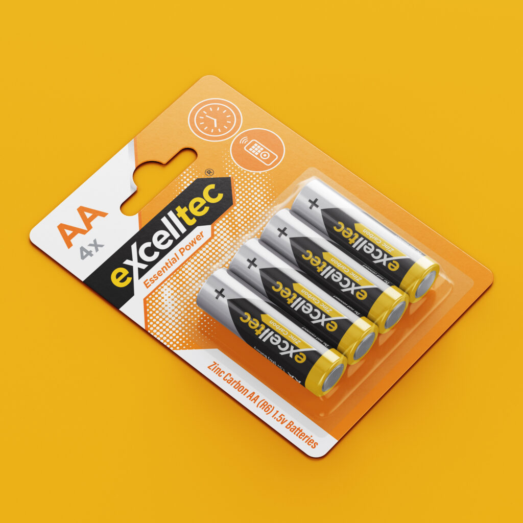
Creating a name and identity for a range of batteries spanning different technologies and styles.
3d render, abstract neon wallpaper, colorful fantastic background with curvy shape glowing in ultraviolet spectrum
Overview
Initial work began with the name for the range, which blended “Excel” for high performance, “cell” as in battery cell, and “Tec” for technology. This range was then segmented by technology, e.g. Zinc Carbon and Alkaline, with different colour palettes introduced for each.
The inclusion of use cases and prominent battery type presented the key information consumers needed in order to make an informed purchase.
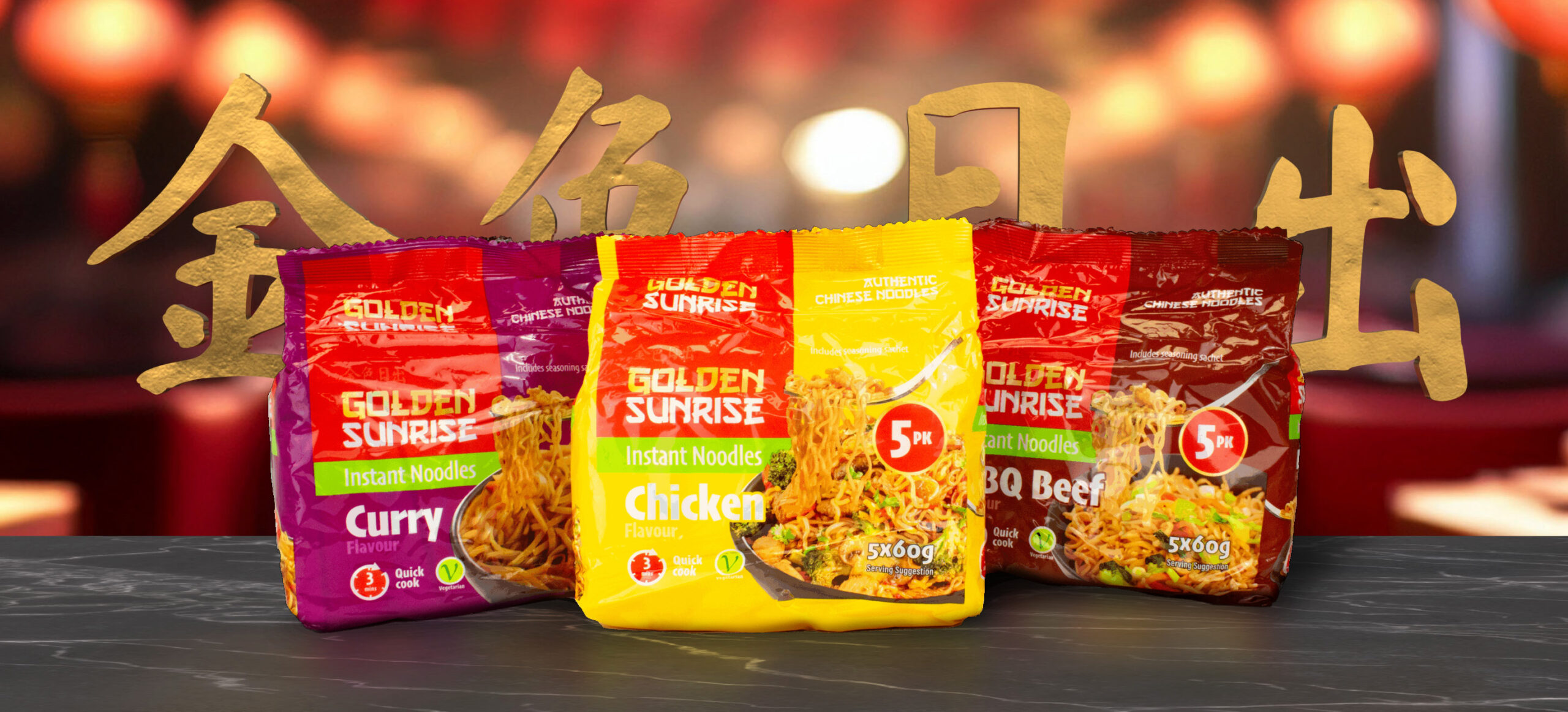
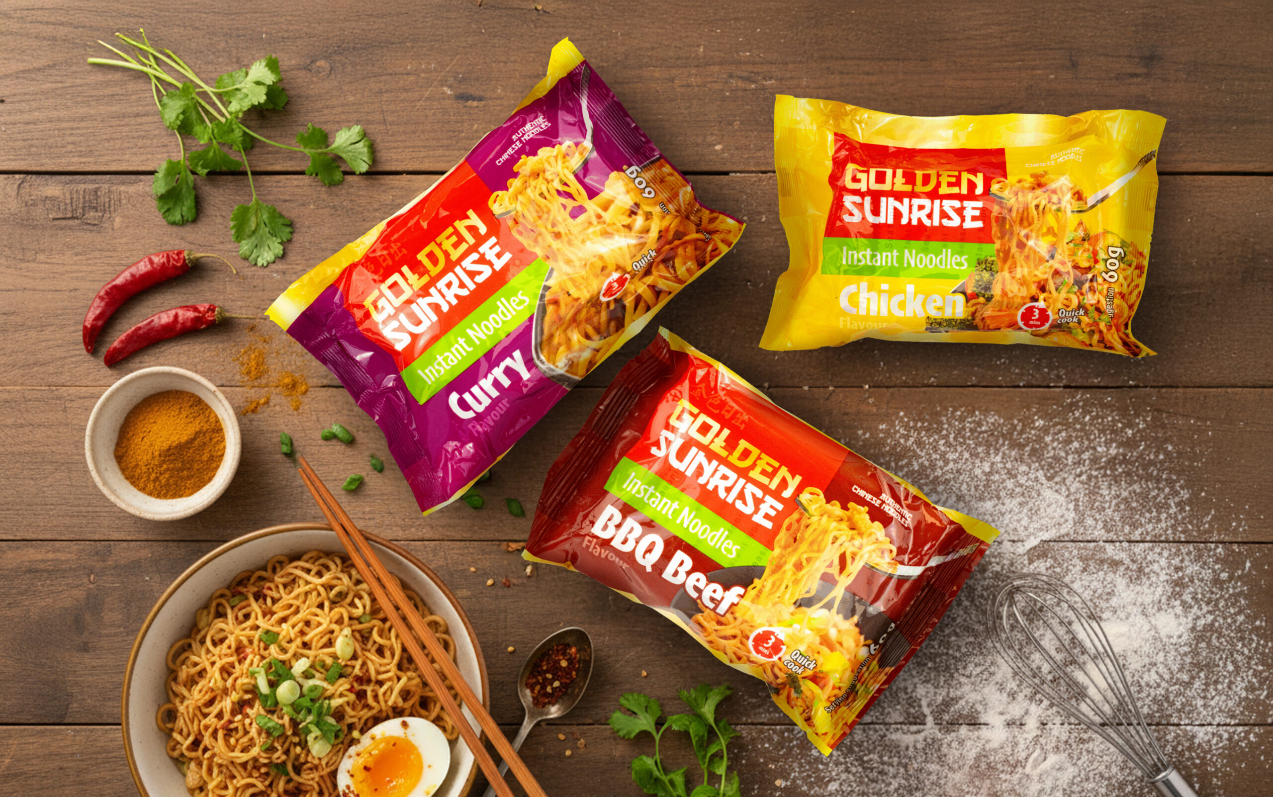
A packaging refresh that would feel modern, authentic, and visually impactful on shelf.
Overview
The Golden Sunrise Instant Noodles range was developed to create a bold shelf presence while staying true to the brand’s wider identity. The aim was to balance a modern, accessible and everyday look with subtle nods towards traditional Chinese cuisine.
Each flavour was distinguished through a vibrant, appetising colour palette, supported by consistent typography and layout for strong brand recognition. Subtle design details added authenticity without overpowering the clean, structured format.
A key part of the project was directing the creation of bespoke serving suggestion imagery. Working with the packaging artworker, I oversaw the process of compositing and enhancing stock images to produce realistic visuals for each pack. These played a central role in bringing the products to life and driving appetite appeal.
The final range helps to create a recognisable visual identity, and effectively positions Golden Sunrise Instant Noodles as a standout choice in a competitive FMCG market.
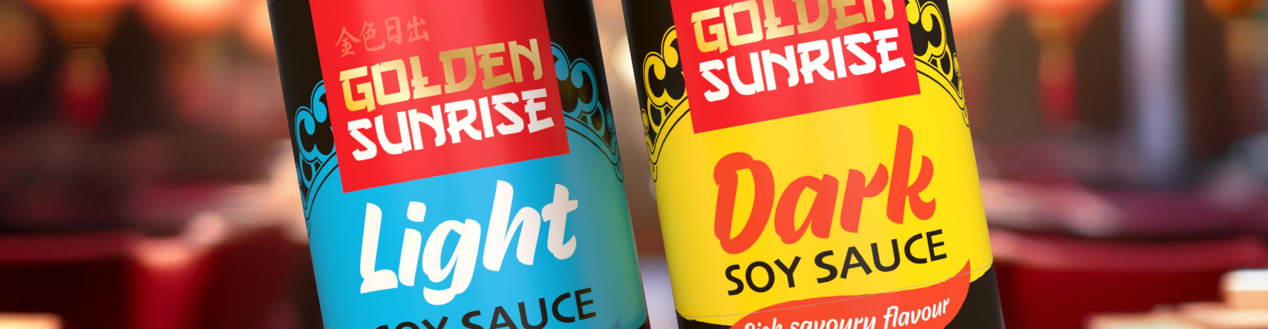
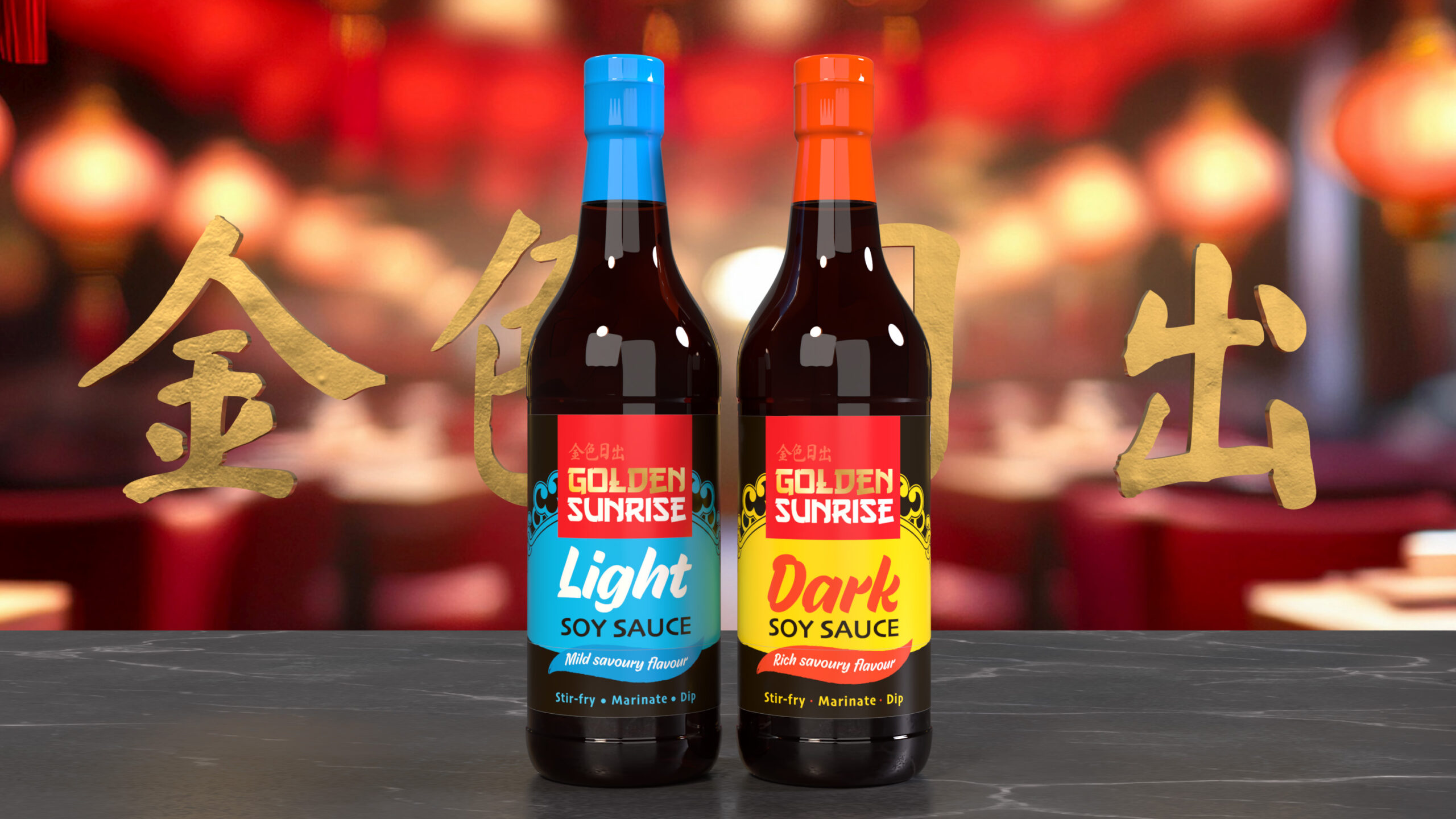
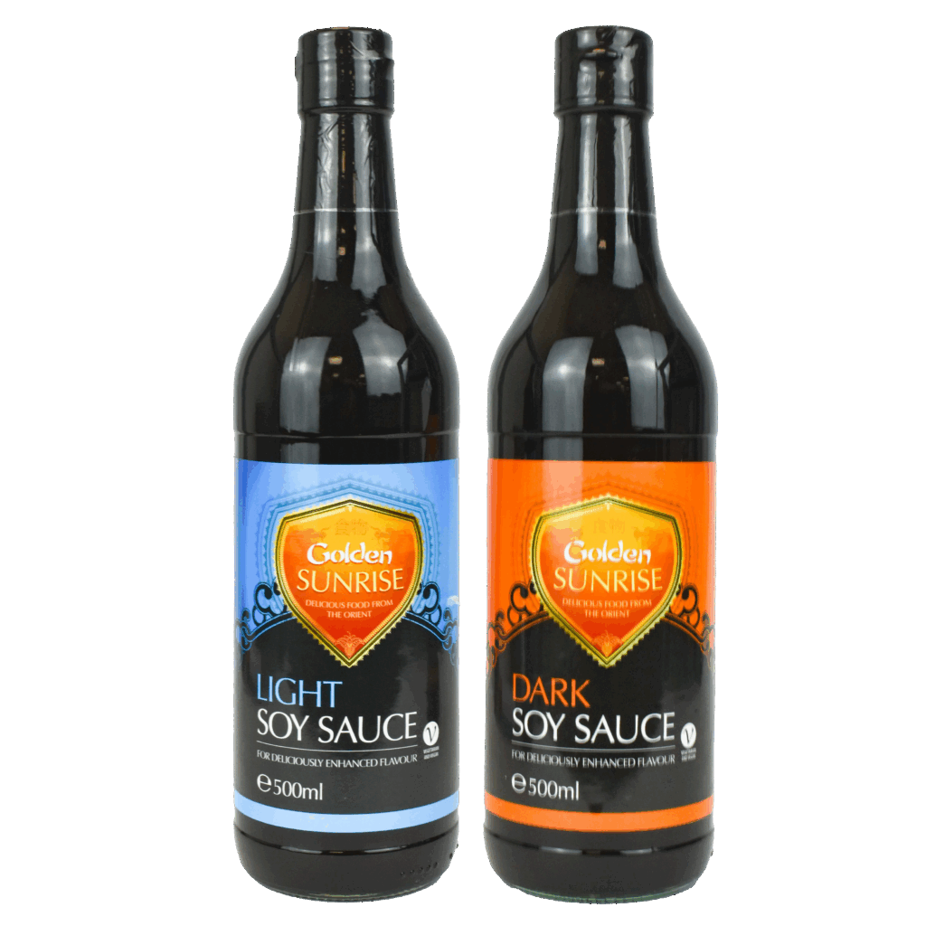
A refreshed label design that modernised the brand and ensured strong shelf presence in the FMCG market.
Overview
Preserving the established colour coding of blue for light and orange for dark soy sauce, I enhanced the product distinction with bold, typography and more vibrant colour coding.
A new “Golden Sunrise” logo created a more distinct and recognisable identity that would be more versatile when it came to range extensions.