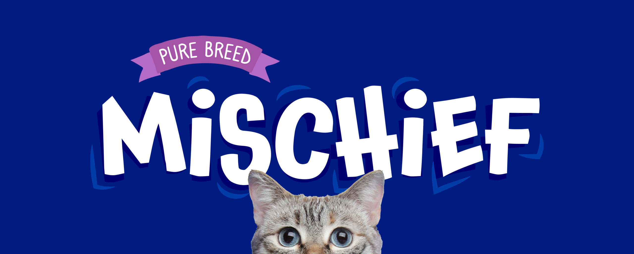
Glamorize Hair Dyes
Adding Glamour
Logo design • Visual identity • Image editing
The brief
The Glamorize women’s hair dye range required a packaging refresh to modernise its look and strengthen its appeal in a competitive FMCG market.
The project
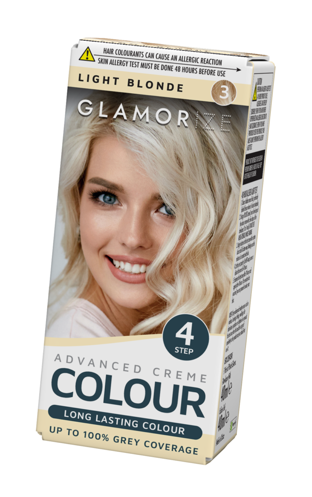
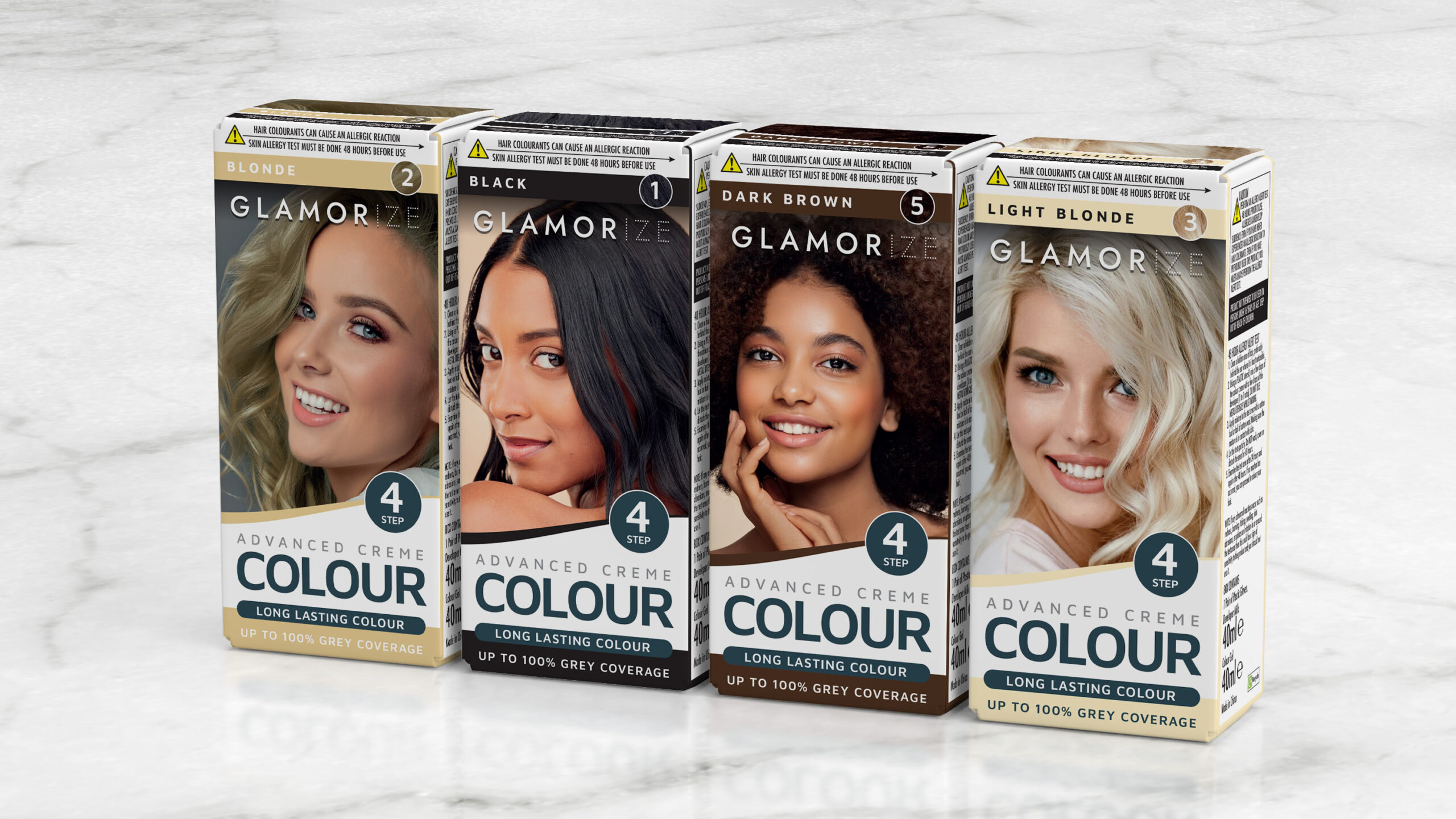
The Glamorize women’s hair dye range needed a refresh to bring it up to date and make it more relevant to today’s consumers. Previously, all six shades were shown using the same model with digitally altered hair, which limited authenticity and connection with the audience.
In the redesign, I introduced a wider selection of stock photography so that each shade featured a different model. This added inclusivity, diversity, and a stronger sense of realism to the brand.
Alongside the creative updates, I worked closely with the buyer and QA manager to ensure the new packaging met strict labelling and compliance requirements.
The final result was a modernised, consumer-friendly range that boosted on-shelf appeal, strengthened brand identity, and made the product easier and more engaging for customers to choose.