Category: Images

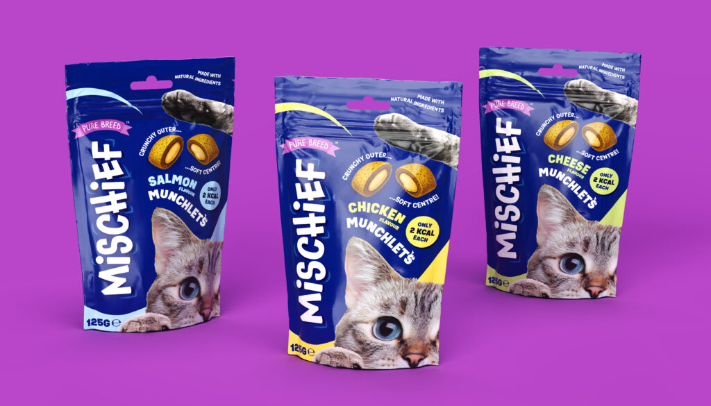
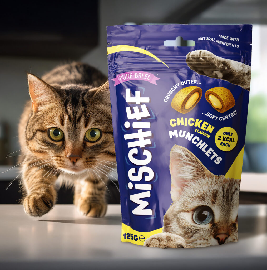
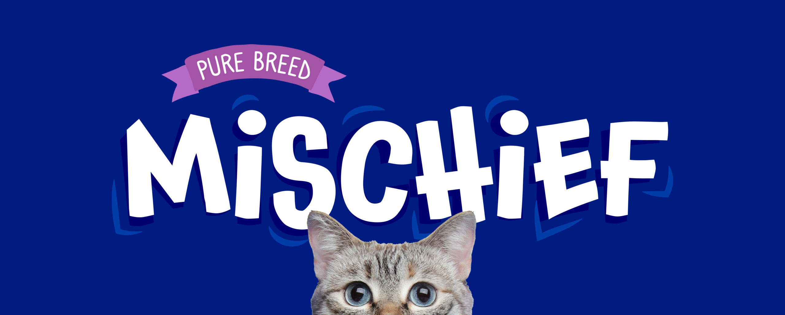
  • Research showed the need for a fresh, playful sub-brand, leading to the name “Mischief”, capturing cats’ cheeky energy. I then began to investigate pack designs and created the product names “Munchlets” and “Lickalots” – two fun, ownable names in keeping with the theme for the sub-brand.

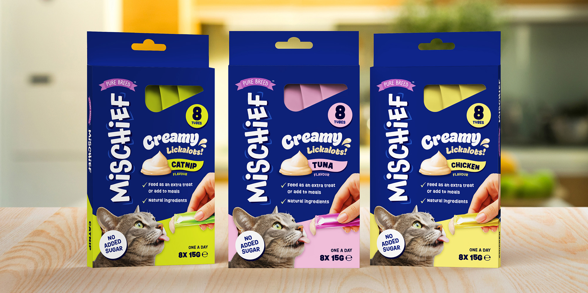
    I led visual identity and packaging design across three flavours for each product, balancing bold shelf presence with charm. Large playful typography, imagery of a cat, and vibrant accents built instant recognition, while illustrations communicated the textures of the products.

    To support sell-in, I produced high-quality 3D pack renders in Adobe Dimension, helping secure UK and European retail listings before stock landed.


  • The first task was to refresh the logo design for the Keep-it Candy brand. The original logo lost clarity at smaller sizes, and its skewed layout made it difficult to adapt alongside future sub-brands.

    To address this, I simplified the design and placed it on a subtle arc for better balance. A vibrant raspberry-red replaced the original red, giving the logo a fresher and fruitier feel. Finally, I introduced a more approachable, playful typeface to unify the updated look and strengthen the brand’s identity.

    The next step was to create a design for the gummy range itself. Settling on “Gummy delights” I worked to develop a packaging style that brought clarity and strong shelf presence through bold use of colour, playful typography, and flavour cues.


  • Building on previous brand work for OTL, I recognised that customers often had several suppliers to choose from, many offering a similar range of products at comparable prices. To set OTL apart, I positioned the flyer around its service proposition, highlighting the clear benefits customers could expect when choosing OTL. I created the headline “Switch. Save. Sell.” as both a bold introduction to the flyer’s message and a subtle nod to the company’s tagline “Save time. Sell more.”

    I then structured the content into four main sections, each supported with concise, benefit-led copy. Following the brand style guide, I incorporated approachable portrait photography to convey the passion and expertise of OTL’s employees – two of the company’s core values – and used the brand’s colour palette to create a clean, easy to navigate layout.