Develop a new brand identity and pack design for a range of cat treats.
Overview
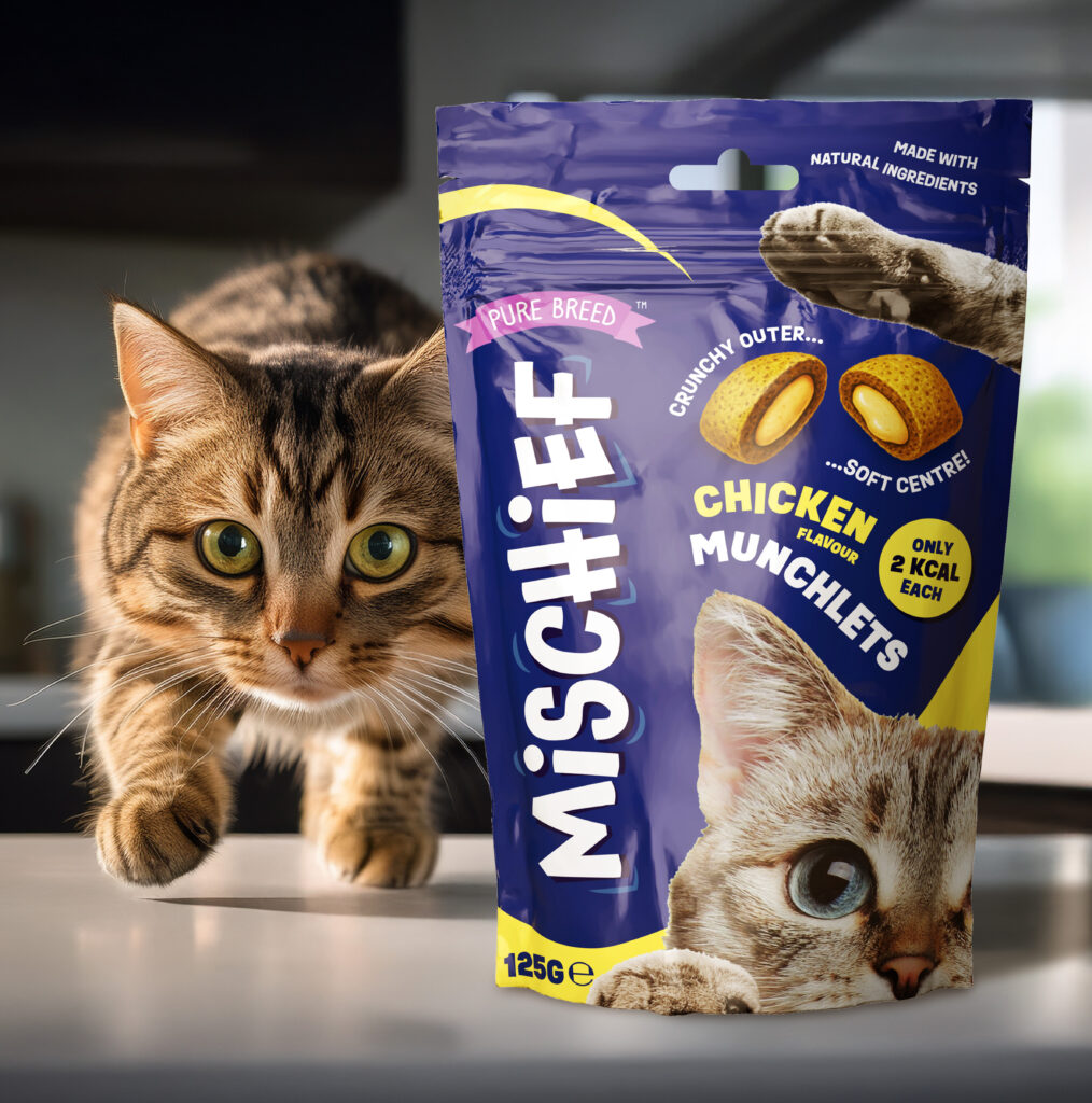
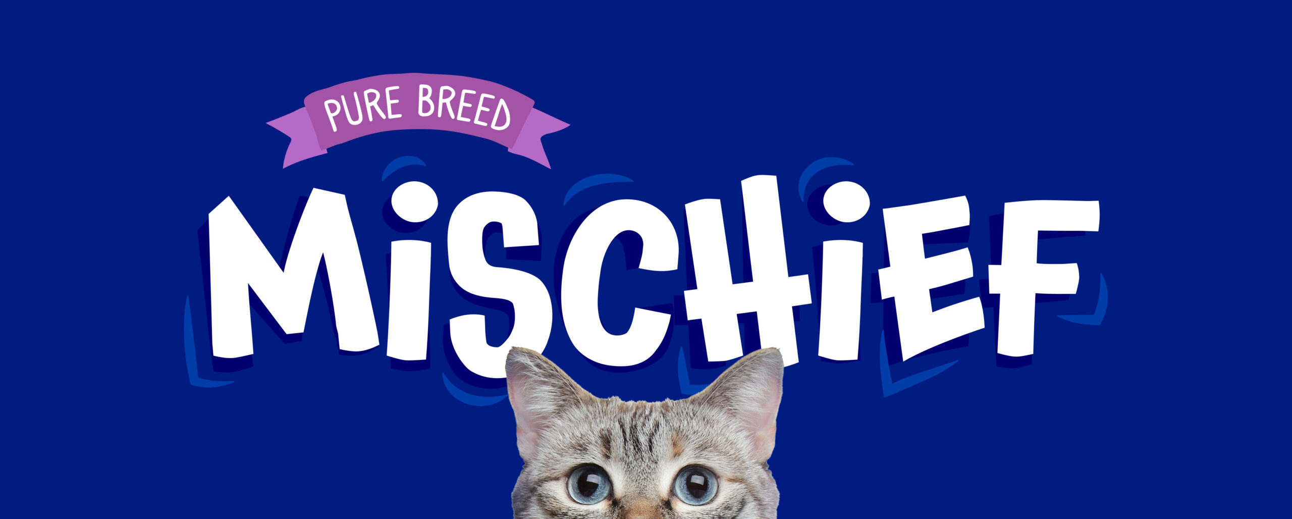
Research showed the need for a fresh, playful sub-brand, leading to the name “Mischief”, capturing cats’ cheeky energy. I also created the product descriptor “Munchlets”, a fun, ownable term for small, snackable treats—together forming the foundation of the range.
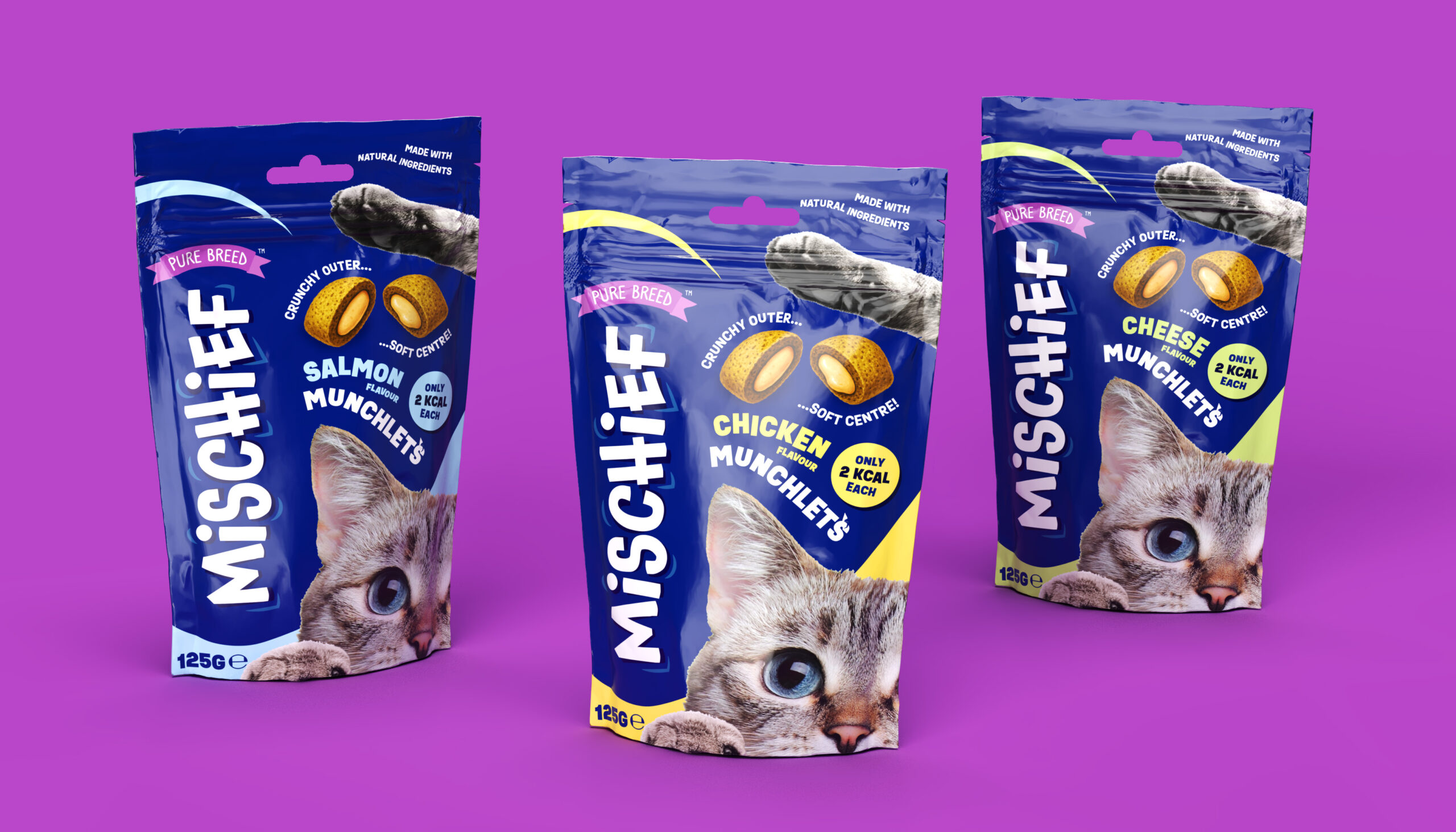
I led visual identity and packaging design across three flavours, balancing bold shelf presence with charm. Large playful typography, a peeking cat, and vibrant accents built instant recognition, while illustrations highlighted the crunchy-soft texture and clear benefits: natural ingredients, low calorie, and soft-centred.
To support sell-in, I produced high-quality 3D pack renders in Adobe Dimension, helping secure UK and European retail listings before stock landed.