Category: Uncategorized

  • Vortex Razors

    Vortex Razors

    Work

    Vortex Razors

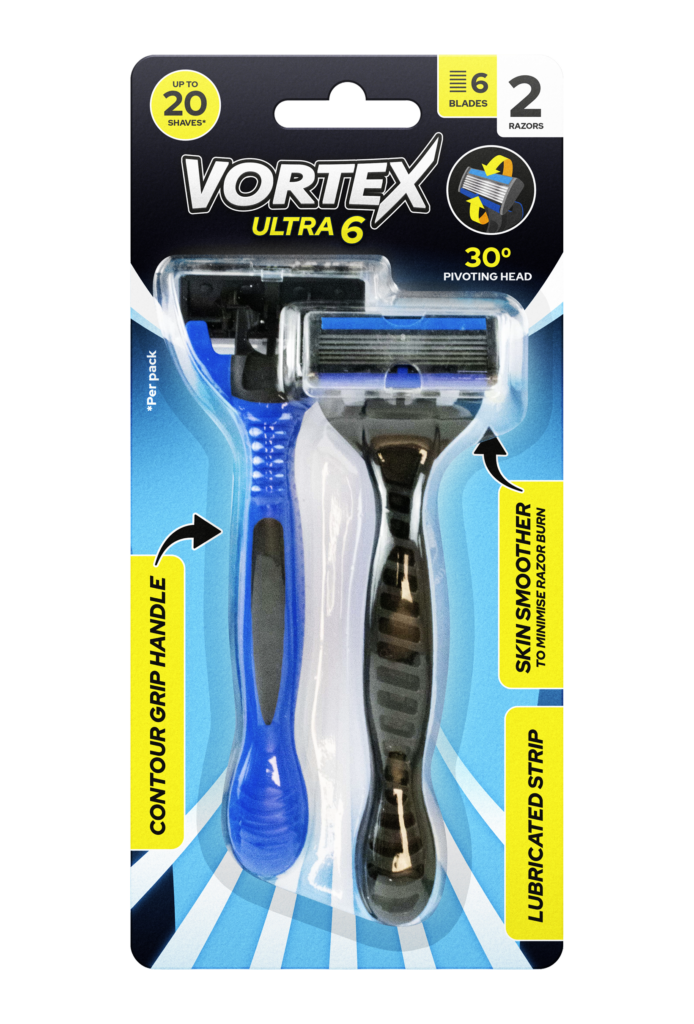
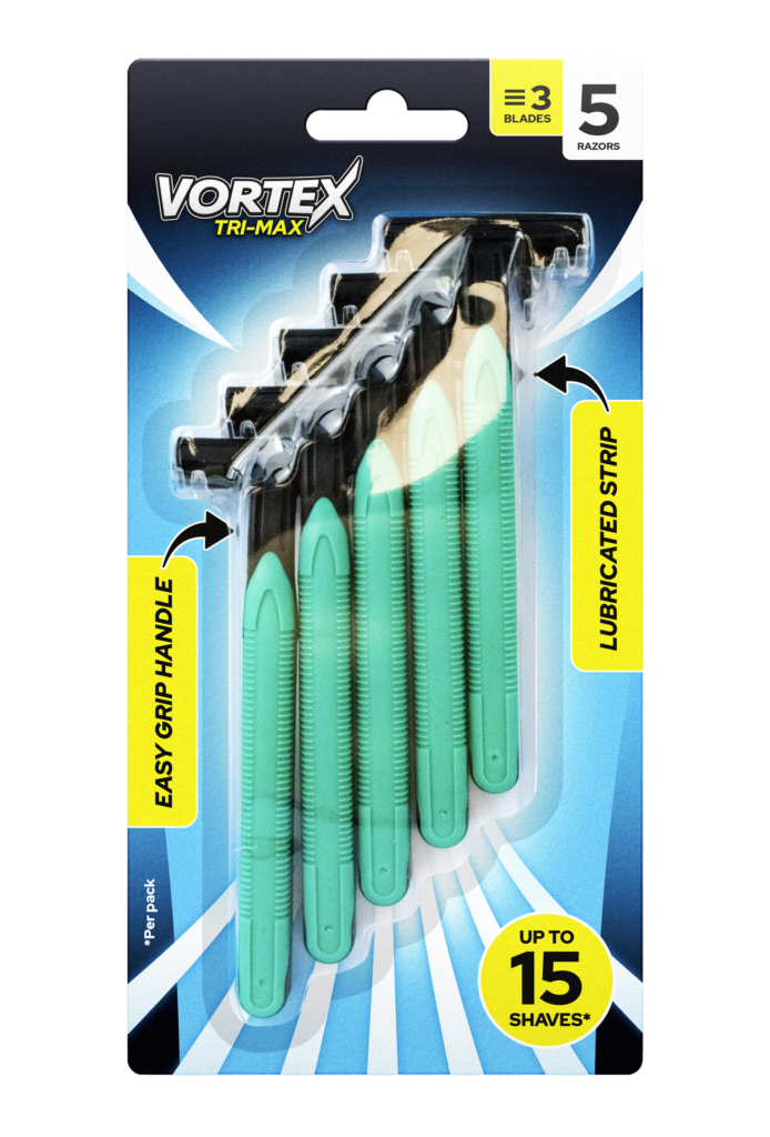
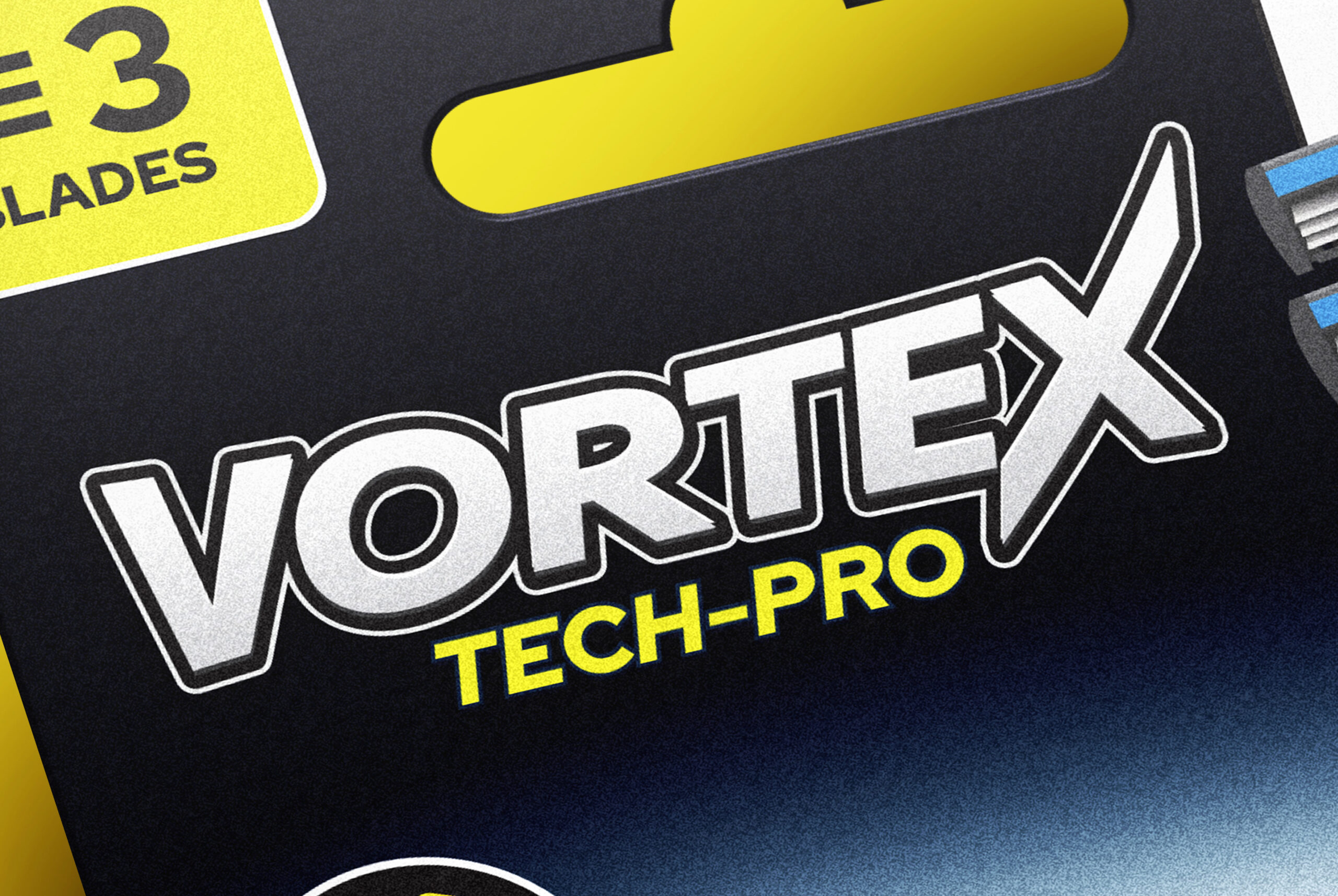
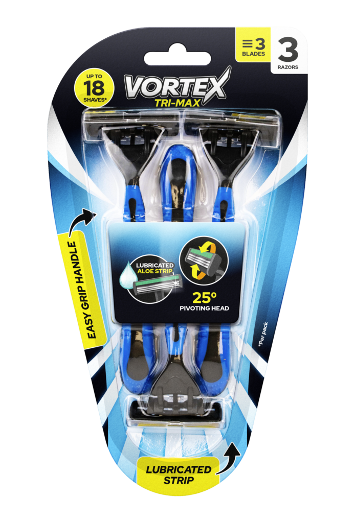
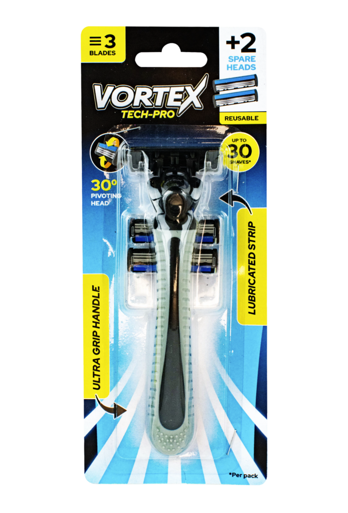
    The Vortex razors range was developed to deliver powerful performance and premium design, standing confidently alongside leading FMCG brands. The challenge was to create a visual identity that felt high-performance, modern, and dynamic, while also clearly communicating the key features and benefits that set Vortex apart from competitors.

    Every design choice was made to reinforce precision and power—from sleek metallic tones and bold typography to high-impact imagery that evokes speed and cutting-edge technology. The packaging was crafted to instantly highlight core product benefits, such as multi-blade technology, pivot angle, and lubrication strips, ensuring consumers could quickly identify the value of the Vortex range.

    Beyond aesthetics, clarity in communication was a key focus. Each product within the range was carefully positioned to resonate with consumers looking for a premium shave at an accessible price point. The end result is a razor range that combines style, value, and performance, standing strong in the competitive grooming market.
  • SecureFix

    SecureFix

    Work

    SecureFix Adhesives

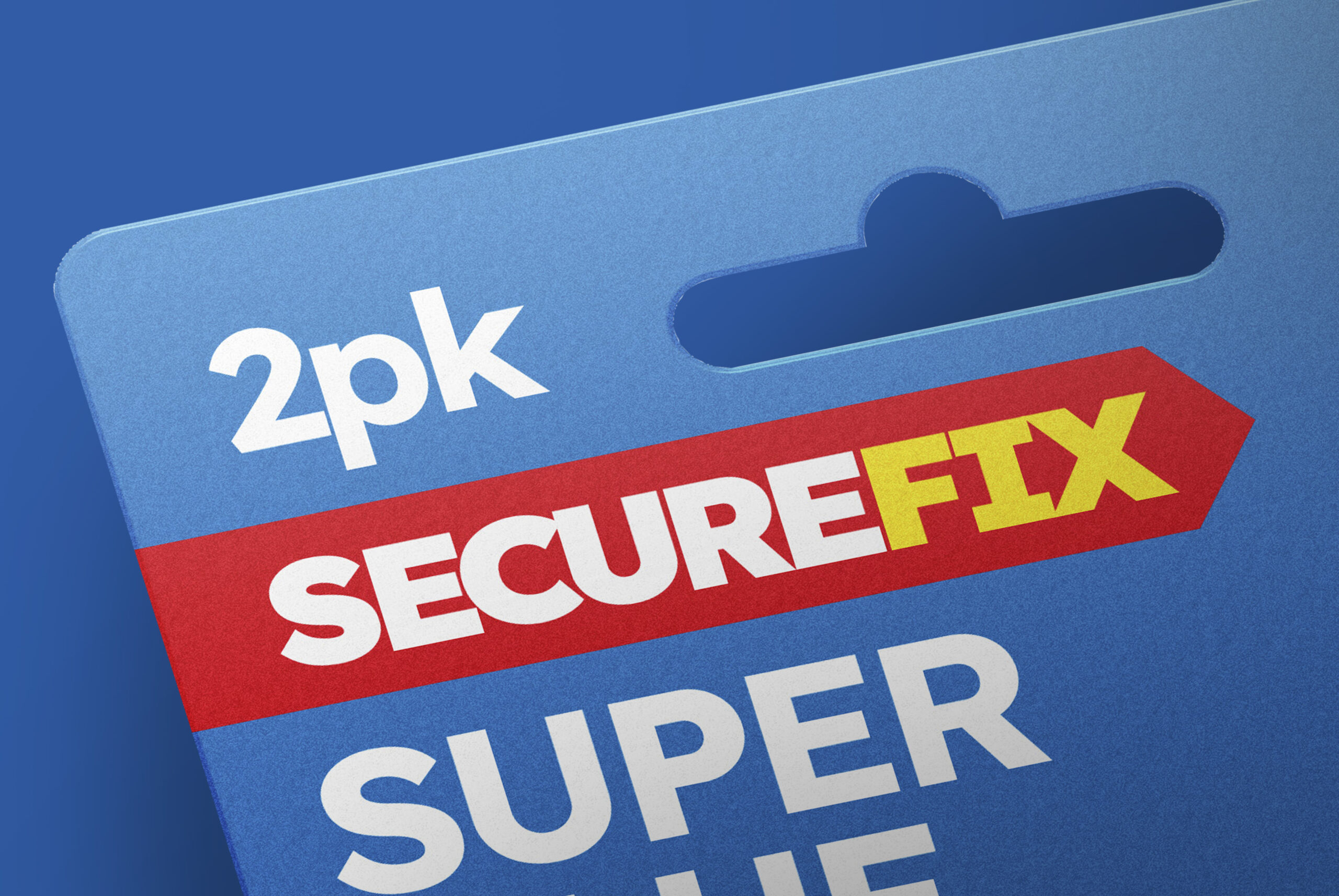
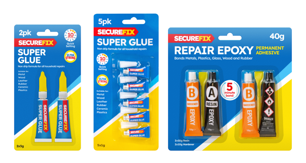
    SecureFix is a brand specialising in adhesive tapes and glues, where clear communication of product features is key to guiding customers to the right solution. The challenge was to refresh the brand’s visual identity, making it bolder, more modern, and easier to navigate on-shelf.

    A crucial part of this refresh was standardising symbols and icons across the range. By developing a clear, uniform system of icons, I ensured that product features—such as water resistance, high strength, and flexibility—were instantly recognisable. This approach not only enhanced clarity for customers but also created a more professional and cohesive look across all packaging.

    In addition to improving usability, I focused on bold, striking design choices to make the brand more impactful. Strong typography, high-contrast colours, and clean layouts were introduced to ensure SecureFix products stood out in a competitive retail environment.

    This refresh successfully positioned SecureFix as a modern, reliable, and easy-to-shop brand, making it simpler for customers to identify the right adhesive solution at a glance.

  • Seasonal Product Launch

    Seasonal Product Launch

    Work

    Seasonal Product Launch

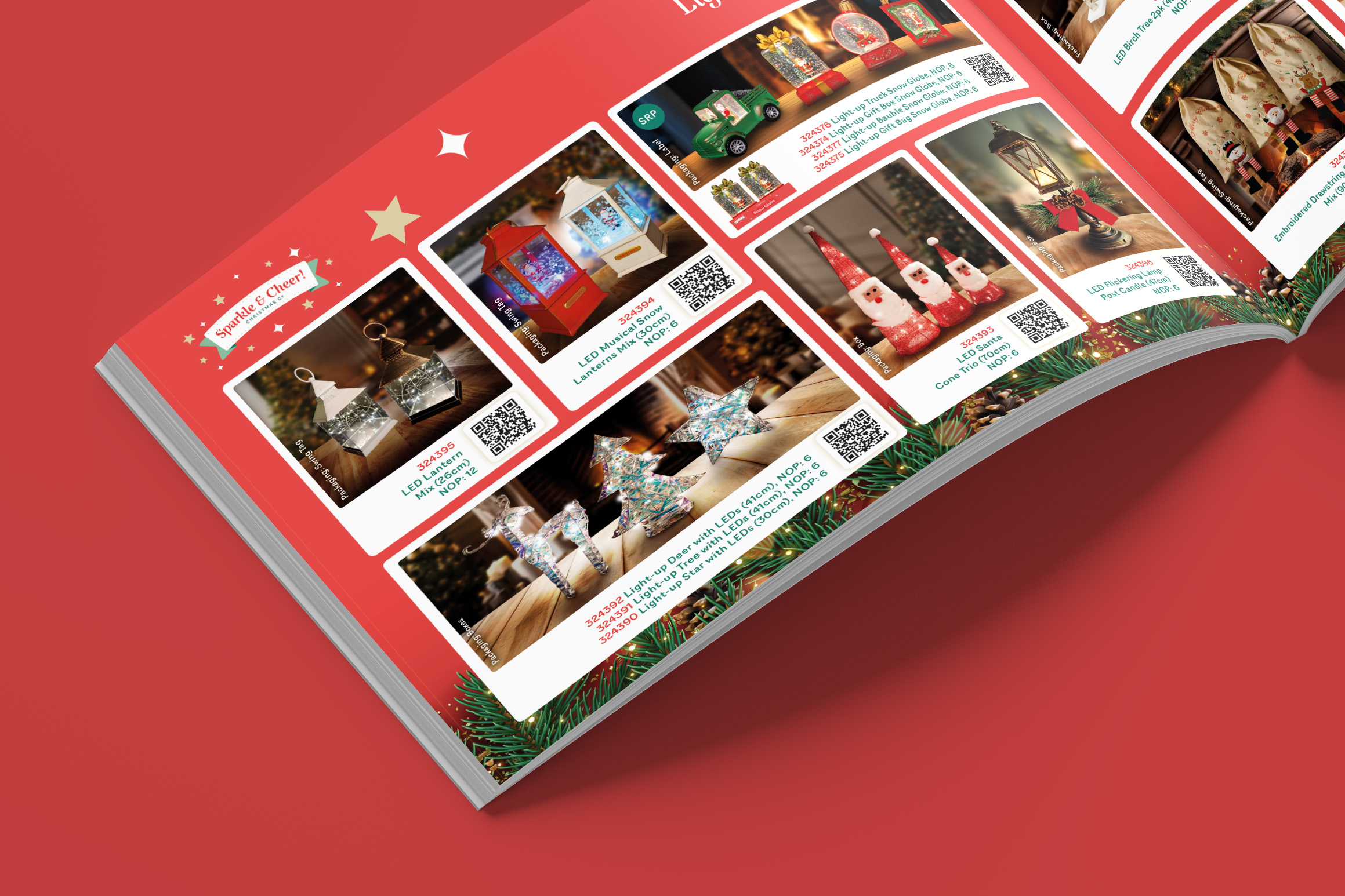
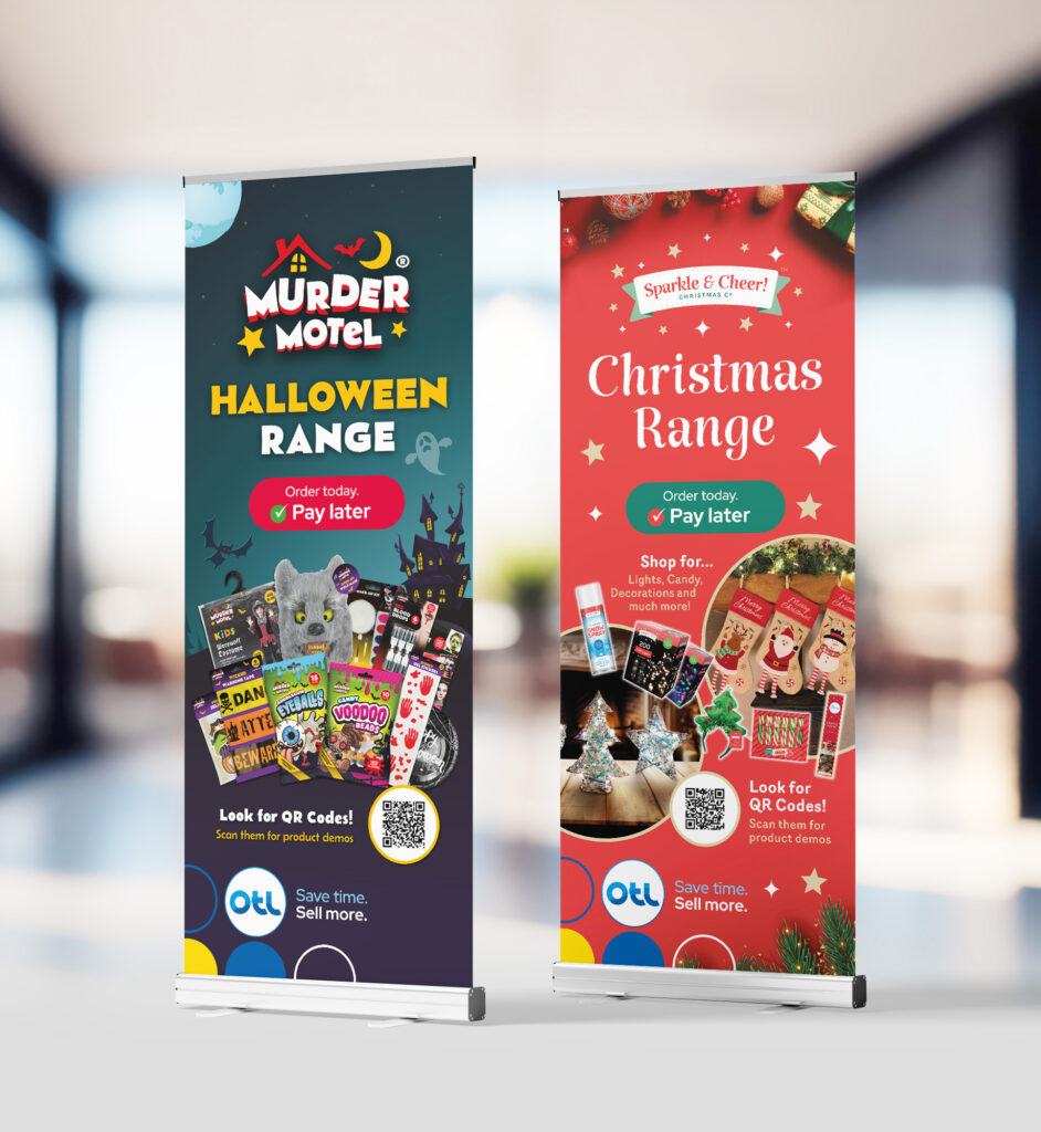
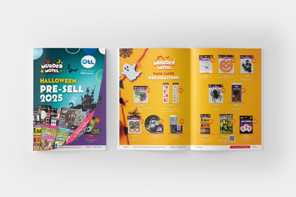
    To support the pre-sell of OTL’s seasonal Christmas and Halloween ranges, I created new logo designs for each range, before producing visually engaging and interactive print collateral, designed to assess demand and optimise order volumes.

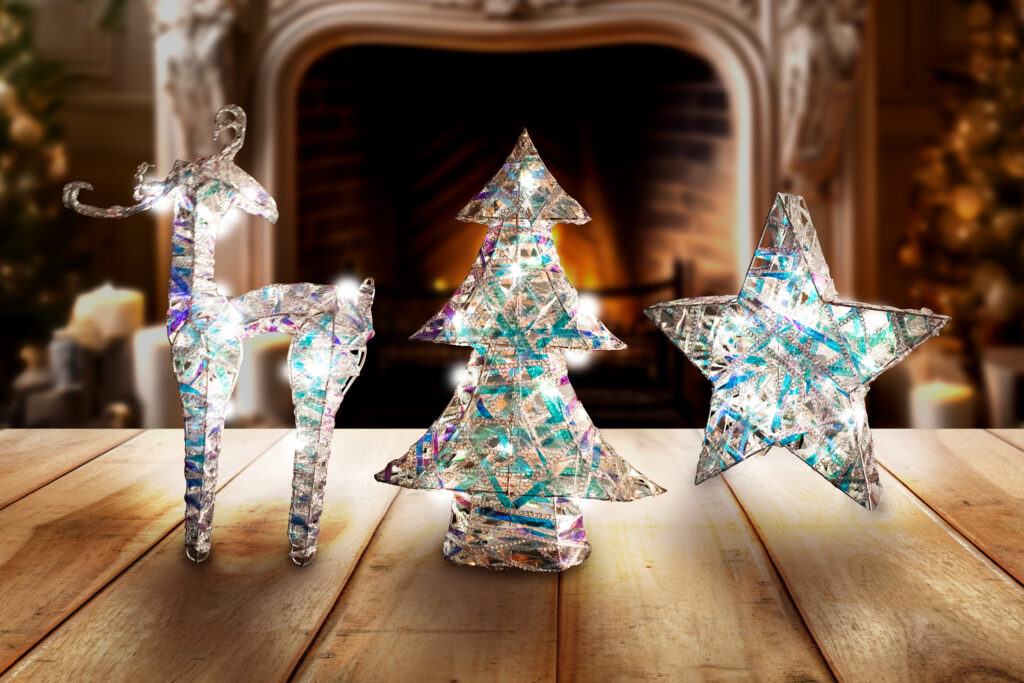
    A key part of this initiative was creating compelling lifestyle imagery to present products in real-world settings. I took product photography and enhanced it using AI-generated backdrops, placing items in seasonally relevant environments. This approach helped bring the products to life in a cost effective and efficient manner, providing customers with a clearer vision of how the products functioned in the real world.

    To further enhance the product proposal, I also recorded product demonstration videos, showcasing features and functionality in action. Each product was accompanied by a QR code, allowing customers to instantly access videos and gain deeper insights into key selling points. This interactive element provided a richer, more informative experience, encouraging customer engagement and boosting confidence in purchasing decisions.

    By combining high-quality visuals with digital interactivity, this launch event successfully strengthened customer interest, provided valuable demand insights, and facilitated more strategic order placements. The result was a more dynamic and immersive pre-sell experience, driving informed purchasing decisions and optimising stock allocation for the season.

  • Golden Sunrise Noodles

    Golden Sunrise Noodles

    Work

    Golden Sunrise Noodles

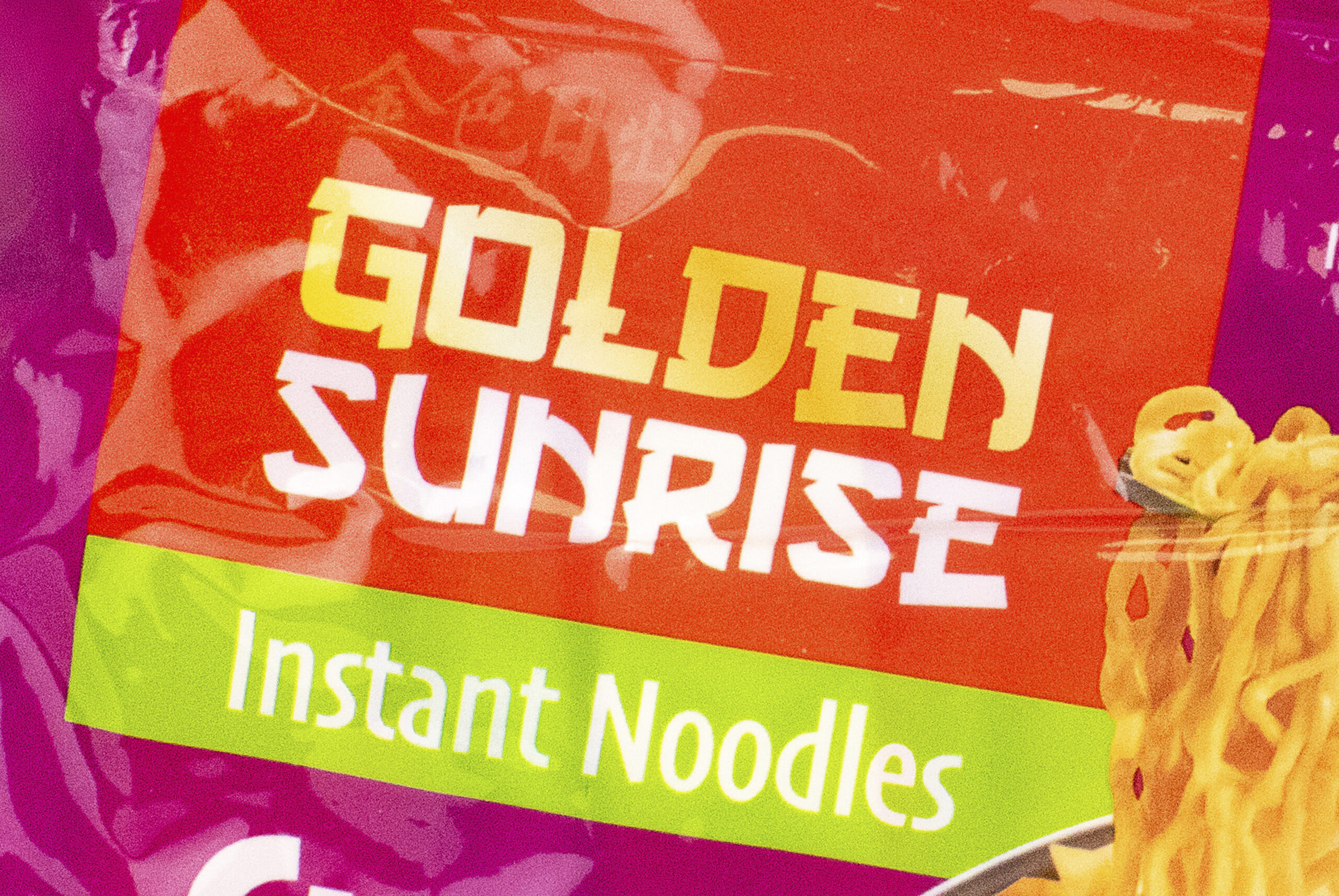
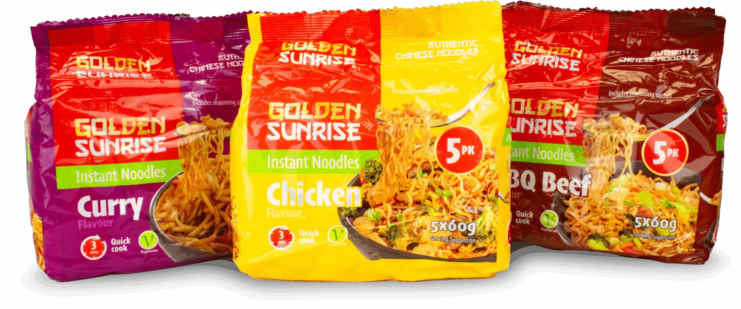
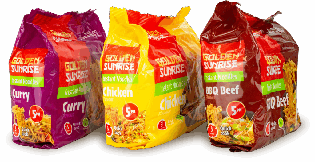
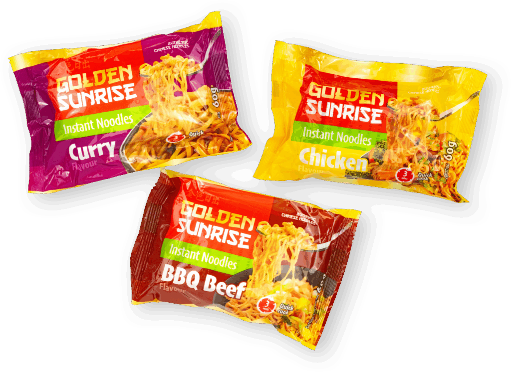
    The Golden Sunrise Instant Noodles range was designed to stand out on the shelves with a vibrant, appetising look while maintaining a subtle connection to traditional Chinese cuisine. The goal was to create a design that felt both modern and authentic, fitting seamlessly within the broader Golden Sunrise product family while having its own unique identity.

    The packaging features a striking colour palette, clearly differentiating flavours while ensuring strong visual impact. The typography and layout maintain a consistent brand feel, while subtle Chinese-inspired details add a layer of authenticity without overwhelming the design. The structured layout ensures instant recognition and a premium, high-quality look.

    A key element of the project was the creation of bespoke serving suggestion images. I oversaw the process of combining stock and AI-generated imagery by the packaging artworker, who carefully composited and enhanced them to produce high-quality, realistic meal visuals for each pack. This helped bring the product to life, making it even more appealing to consumers.

    The result is a bold, appetising, and well-integrated product line that not only commands attention but also builds strong brand recognition within the competitive instant noodle market.

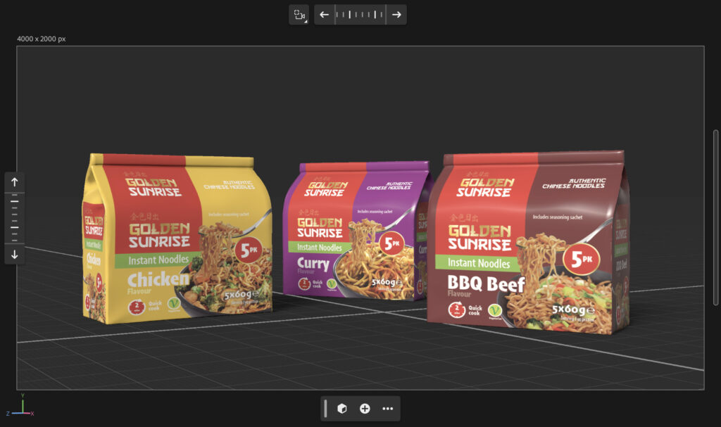
    Prior to production samples being created, I used Adobe Dimension and Photoshop to create visual mockups to serve as marketing aids.

  • Website Rebrand

    Website Rebrand

    Work

    Website Rebrand

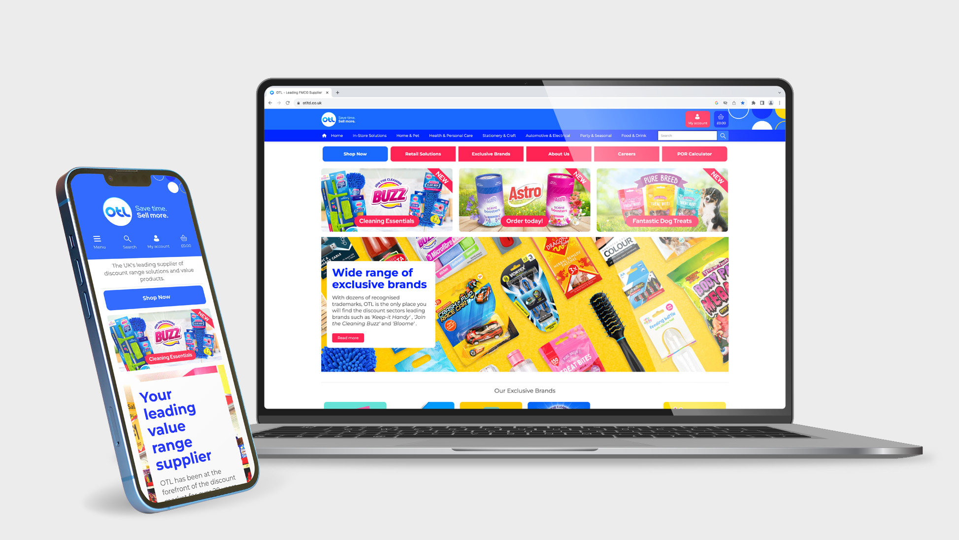
    Collaborating with the Head of Digital, I played a key role in applying a rebrand to the company website, ensuring it aligned seamlessly with the updated brand guidelines. Working within the constraints of the default CMS templates, I overlaid custom CSS to refine the design, tailoring layouts, typography, and styling to create a more cohesive and visually engaging experience.

    Beyond aesthetics, I helped shape the website’s static content and structure, working closely with the Head of Digital to craft copy and construct layouts that effectively communicated the brand’s key messages and points of difference. Once the structure and content were finalised, I implemented them using responsive HTML and CSS, ensuring a balance between visual appeal, usability, and functionality on both mobile and desktop.

    The ultimate goal was to provide customers with the information they needed to make a purchase, while reinforcing the brand’s identity and value proposition. This project brought together technical execution and brand storytelling, allowing me to combine custom coding with a strategic approach to content and design.

  • Prism Cleaning

    Prism Cleaning

    Work

    Prism Cleaning

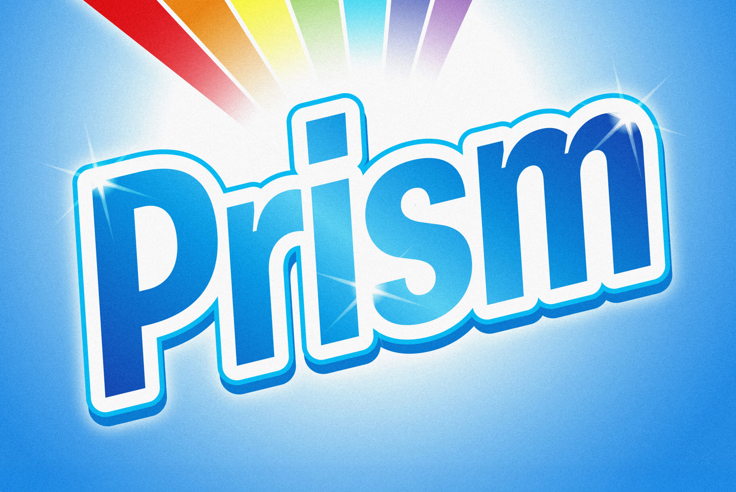
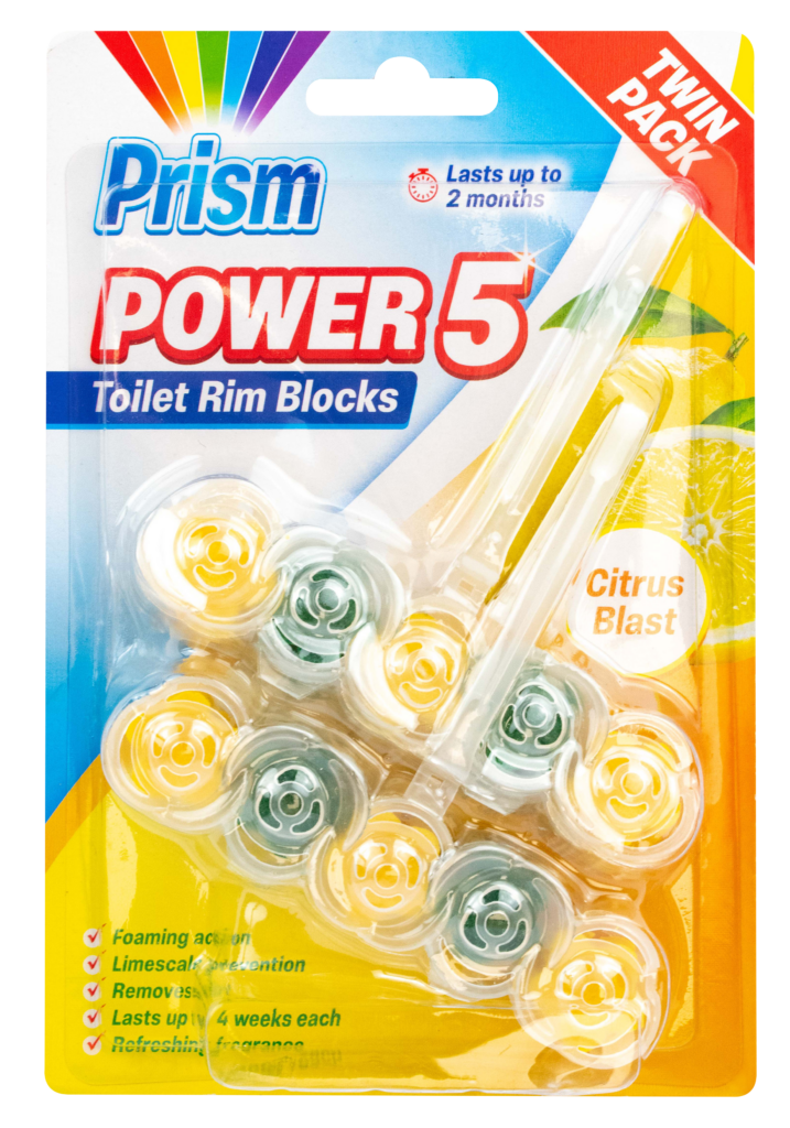
    I developed the brand identity and packaging design for Prism, a household cleaning product designed to stand out on shelves while communicating effectiveness and performance.

    I created the name “Power 5” for this family of products to create a strong identity for the products and used bold, dynamic elements to convey product confidence. Distinct colour schemes were used to differentiate the fragrance variants, whilst still adhering to consistent structural elements. “Citrus Blast” uses bright yellows and oranges with fruit imagery for an energising feel, while “Ocean Wave” incorporates cool blues with water-inspired visuals to emphasise freshness and cleanliness.

    The packaging for this product also incorporated CLP (Classification, Labelling and Packaging) information as part of the back of pack information. Having worked closely with QA teams, understanding the correct layout and formatting for back of pack information is key for ensuring compliance and the effective communication of hazards present.