Work
Crosby Shoecare
Crosby Shoecare was developed to embody a sense of tradition and heritage, reflecting the craftsmanship and reliability expected from premium shoe care products. The brand’s name was carefully chosen to evoke this timeless quality, positioning it as a trusted choice for customers seeking to protect and maintain their footwear.
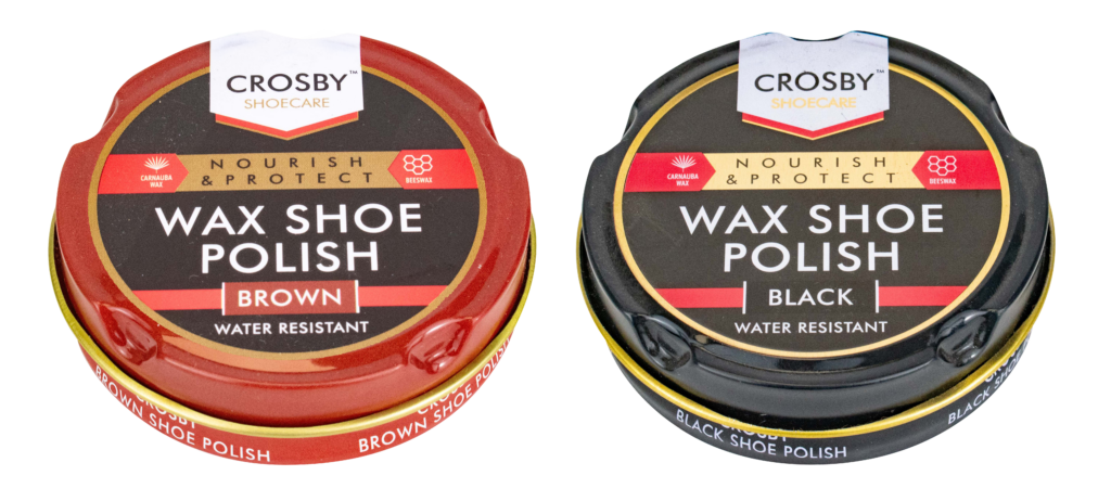
The original Crosby range includes classic wax shoe polishes in black and brown, designed with a sophisticated, heritage-inspired aesthetic. The bold typography, rich colour palette, and gold accents communicate durability and quality, reinforcing Crosby’s traditional values.
However, as the brand expanded into the sneaker care market, a more contemporary and youthful approach was required. The introduction of Trainer Wipes—a product catering to sneaker enthusiasts—demanded a sportier, more dynamic visual identity while still feeling like an authentic part of the Crosby range.
To achieve this balance, I maintained the same font family used in the original range but adapted the weights and styling to create a fresher, more energetic look. The bold contrast of black and gold, paired with a sleek, modern layout, aligns the Trainer Wipes with the contemporary sneaker culture while ensuring consistency within the Crosby lineup. This approach allows the brand to bridge the gap between heritage and modern footwear care, appealing to both traditional users and a younger, style-conscious audience.