Work
Golden Sunrise Soy Sauce
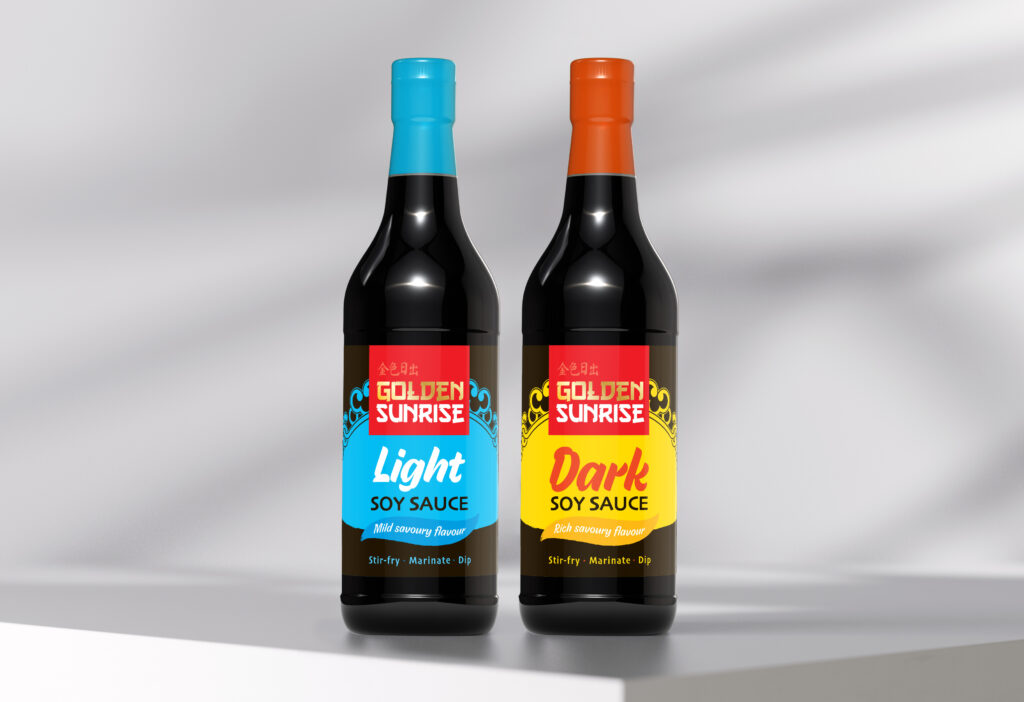
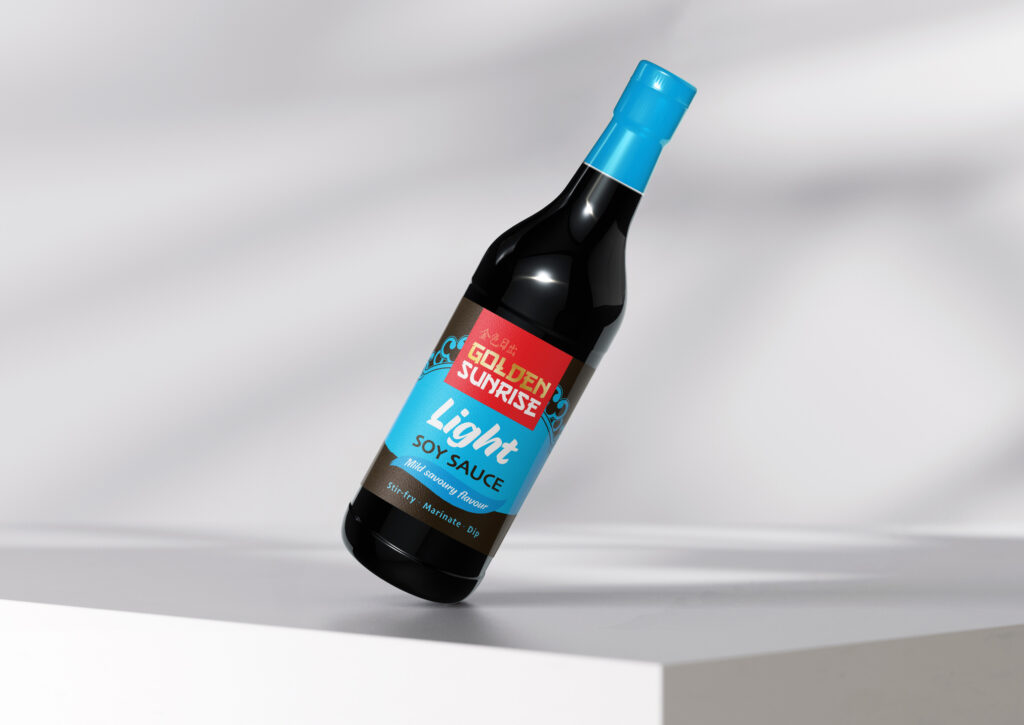
Golden Sunrise needed updated labels for its soy sauce to better align with modern market expectations and better capture the brand’s potential on the shelf. My goal was to create a fresh, contemporary visual identity while maintaining the brand’s heritage within the FMCG sector and ensuring clear product distinction.

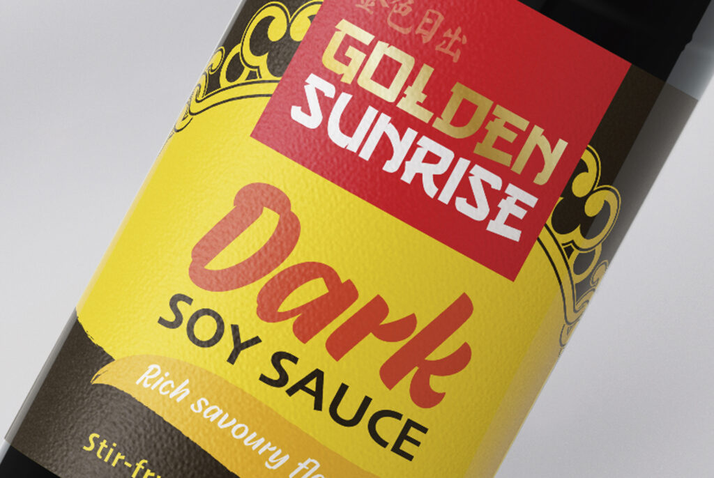
A key part of the redesign was introducing a bold, structured layout with strong typography that enhances readability and impact. The new design successfully modernises the brand while maintaining its authenticity. By balancing tradition with a contemporary aesthetic, the packaging not only strengthens brand recognition but also enhances the overall shopping experience. This update positions Golden Sunrise competitively in the market, making it more visually appealing and accessible to both loyal customers and new audiences.


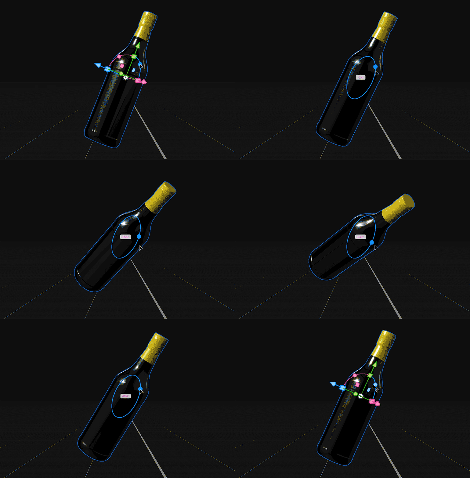
For this project I also began experimenting with Adobe Dimension. I created a model of the bottle in Adobe Illustrator, before importing it in to Adobe Dimension to apply the material types. I then rendered out the bottle as a PSD file, which I edited in Adobe Photoshop to create visual mockups.