Murder Motel
Revitalising Halloween
Logo design • Visual identity
The brief
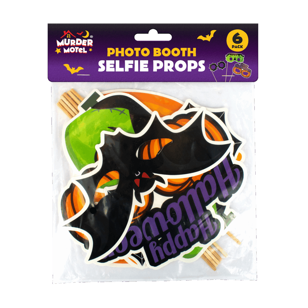
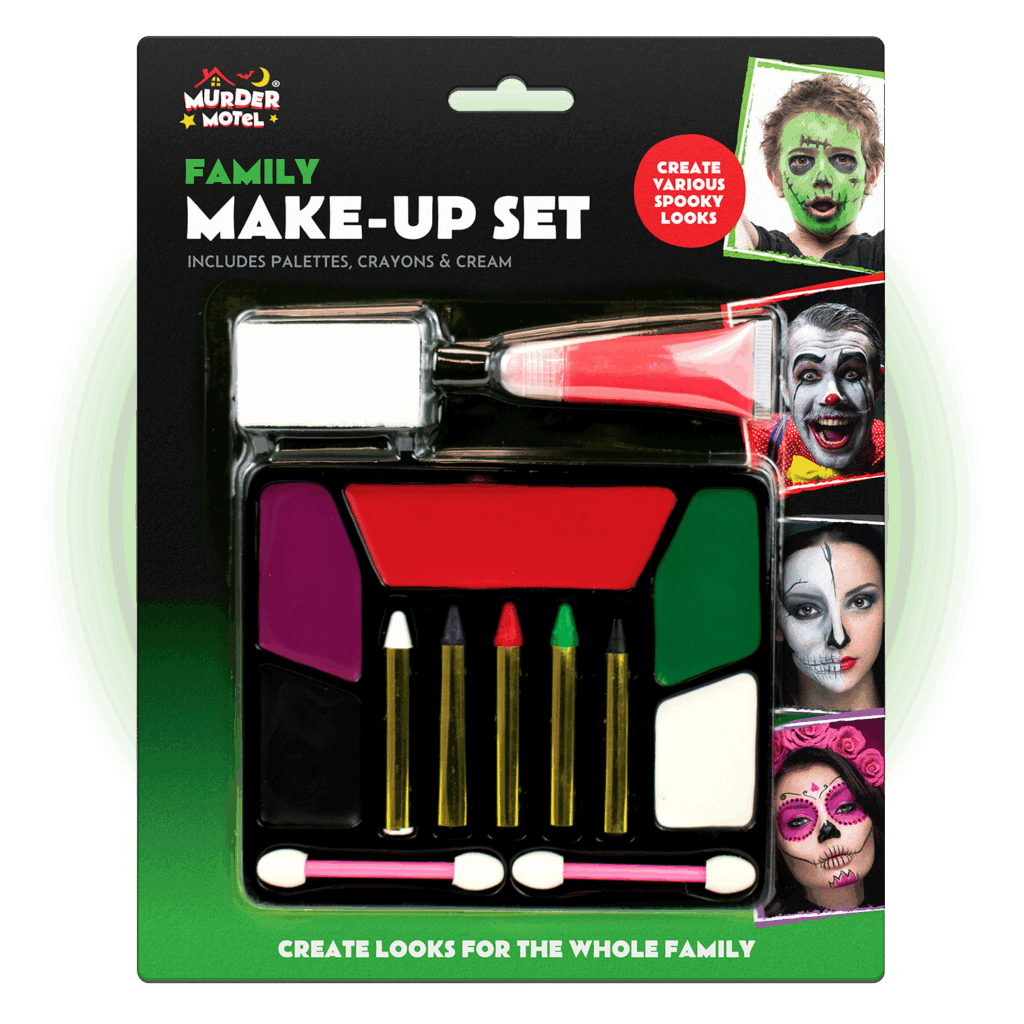
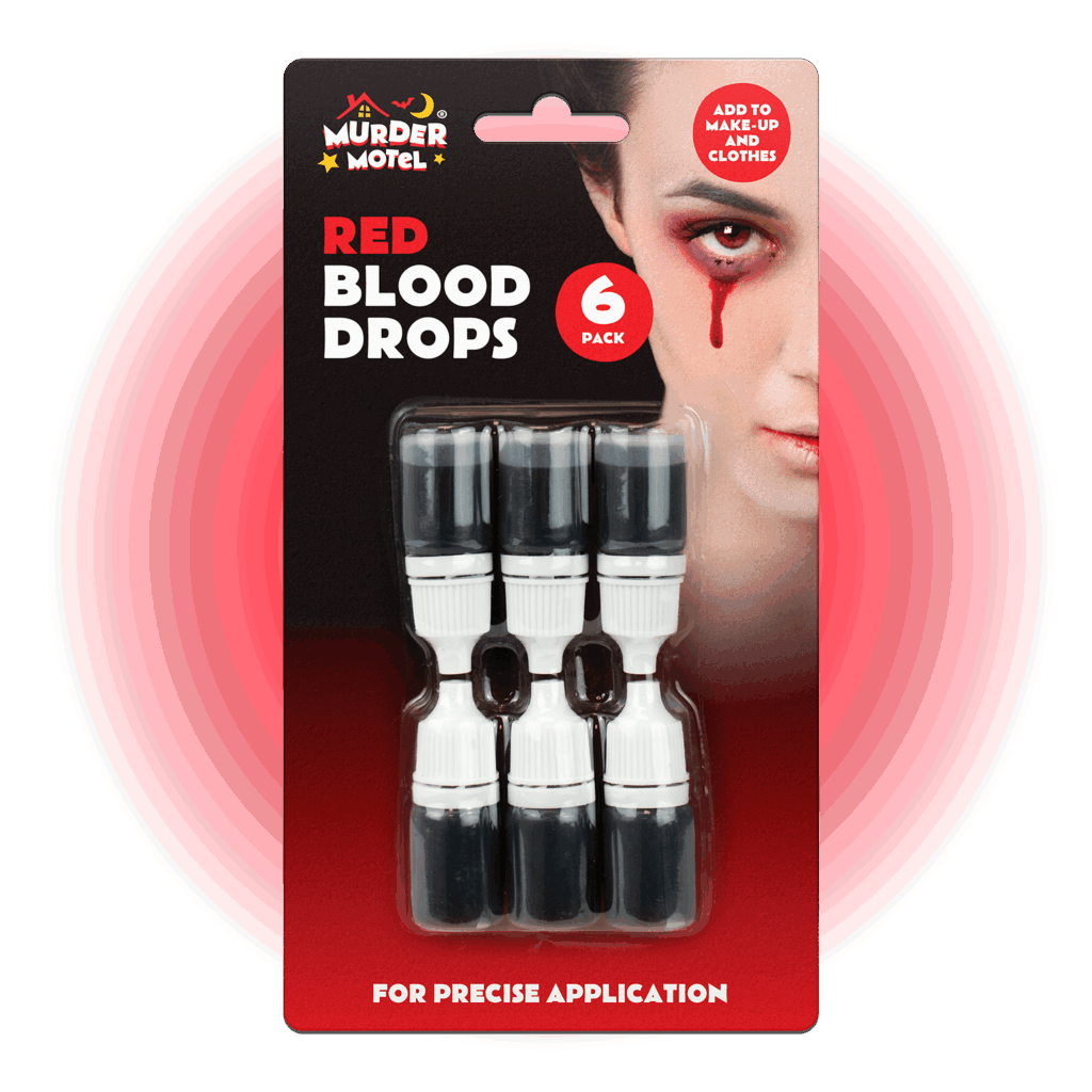
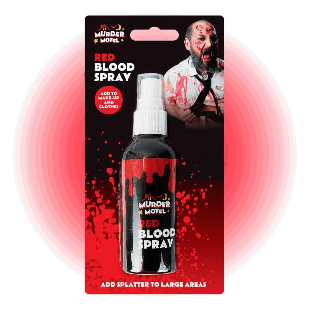
Murder Motel needed a refreshed brand identity adaptable across confectionery, makeup, fancy dress, and decorations, with packaging that brought a vibrant, spooky aesthetic to its seasonal products.
The project
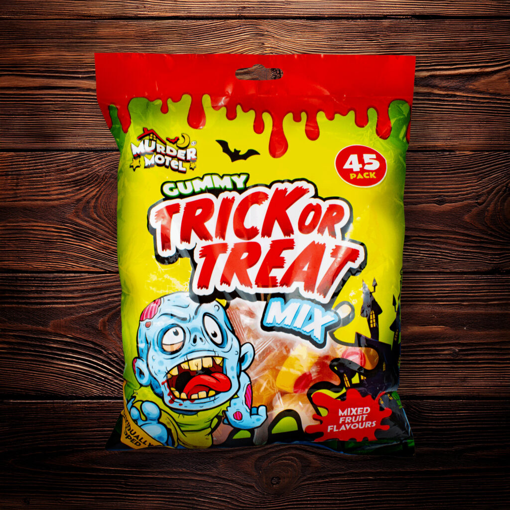
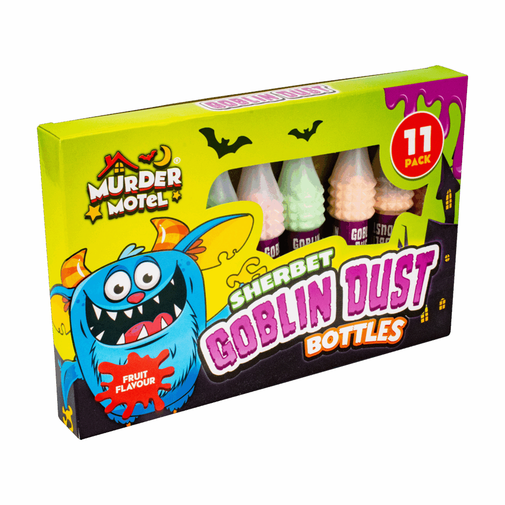
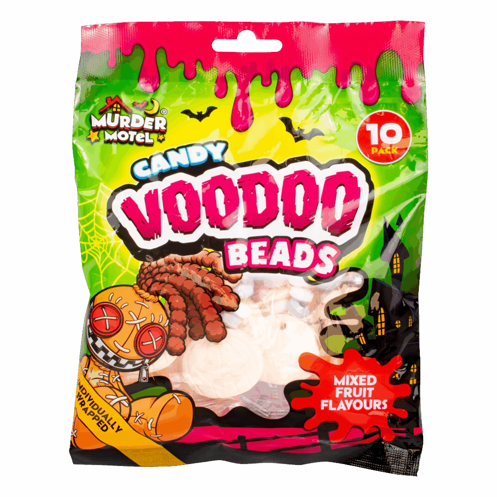
The Murder Motel range had become fragmented, with inconsistent logos across its confectionery and make-up products, highlighting the need for a unified identity to strengthen brand recognition. Research also revealed that the existing packaging relied too heavily on gruesome photography, particularly in the make-up line, and needed repositioning towards a more playful, cartoon-horror aesthetic.
The new logo leans into the brand name, combining a motel roofline with illustrative stars, a moon, and a bat to capture a fun, spooky personality.
For the confectionery range, bold and varied typography gave each pack its own character while ensuring strong shelf impact. Adapted monster illustrations added individuality and reinforced the Halloween theme, while key details such as flavours, pack sizes, and value messages were clearly structured to drive purchase appeal.