Work
Prism Cleaning
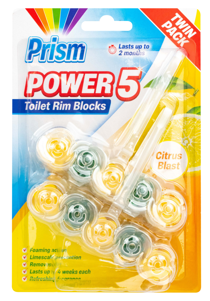
I developed the brand identity and packaging design for Prism, a household cleaning product designed to stand out on shelves while communicating effectiveness and performance.
I created the name “Power 5” for this family of products to create a strong identity for the products and used bold, dynamic elements to convey product confidence. Distinct colour schemes were used to differentiate the fragrance variants, whilst still adhering to consistent structural elements. “Citrus Blast” uses bright yellows and oranges with fruit imagery for an energising feel, while “Ocean Wave” incorporates cool blues with water-inspired visuals to emphasise freshness and cleanliness.
The packaging for this product also incorporated CLP (Classification, Labelling and Packaging) information as part of the back of pack information. Having worked closely with QA teams, understanding the correct layout and formatting for back of pack information is key for ensuring compliance and the effective communication of hazards present.


