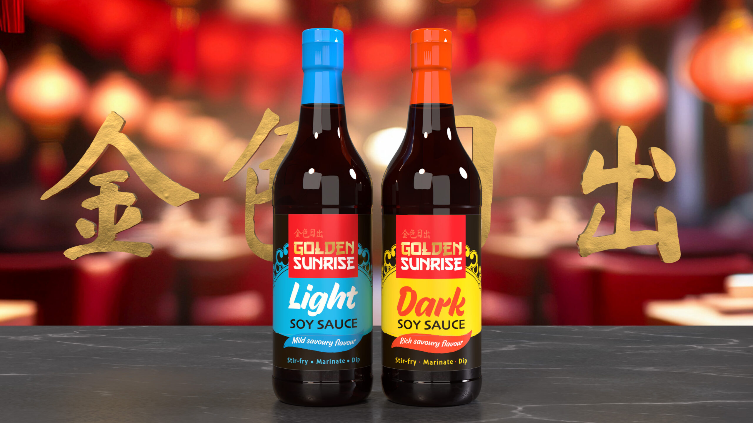
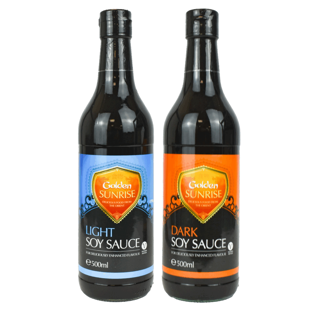
A refreshed label design that modernised the brand and ensured strong shelf presence in the FMCG market.
Overview
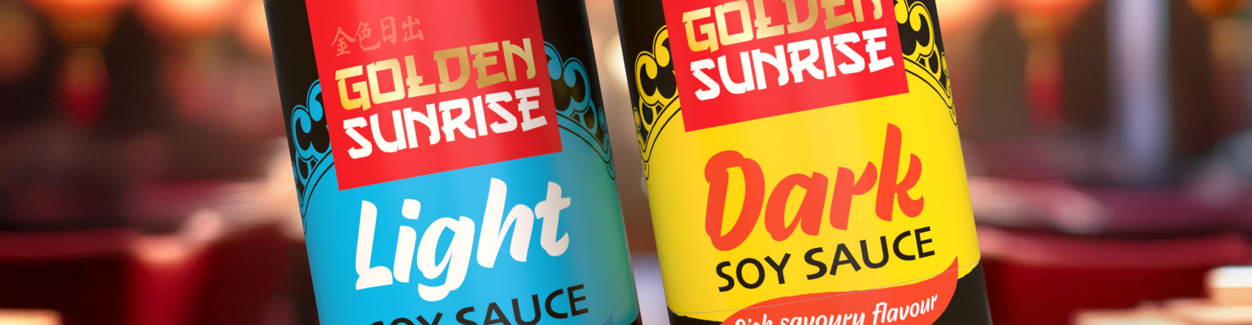
Preserving the established colour coding of blue for light and orange for dark soy sauce, I enhanced the product distinction with bold, typography and more vibrant colour coding.
A new “Golden Sunrise” logo created a more distinct and recognisable identity that would be more versatile when it came to range extensions.