Category: Layout

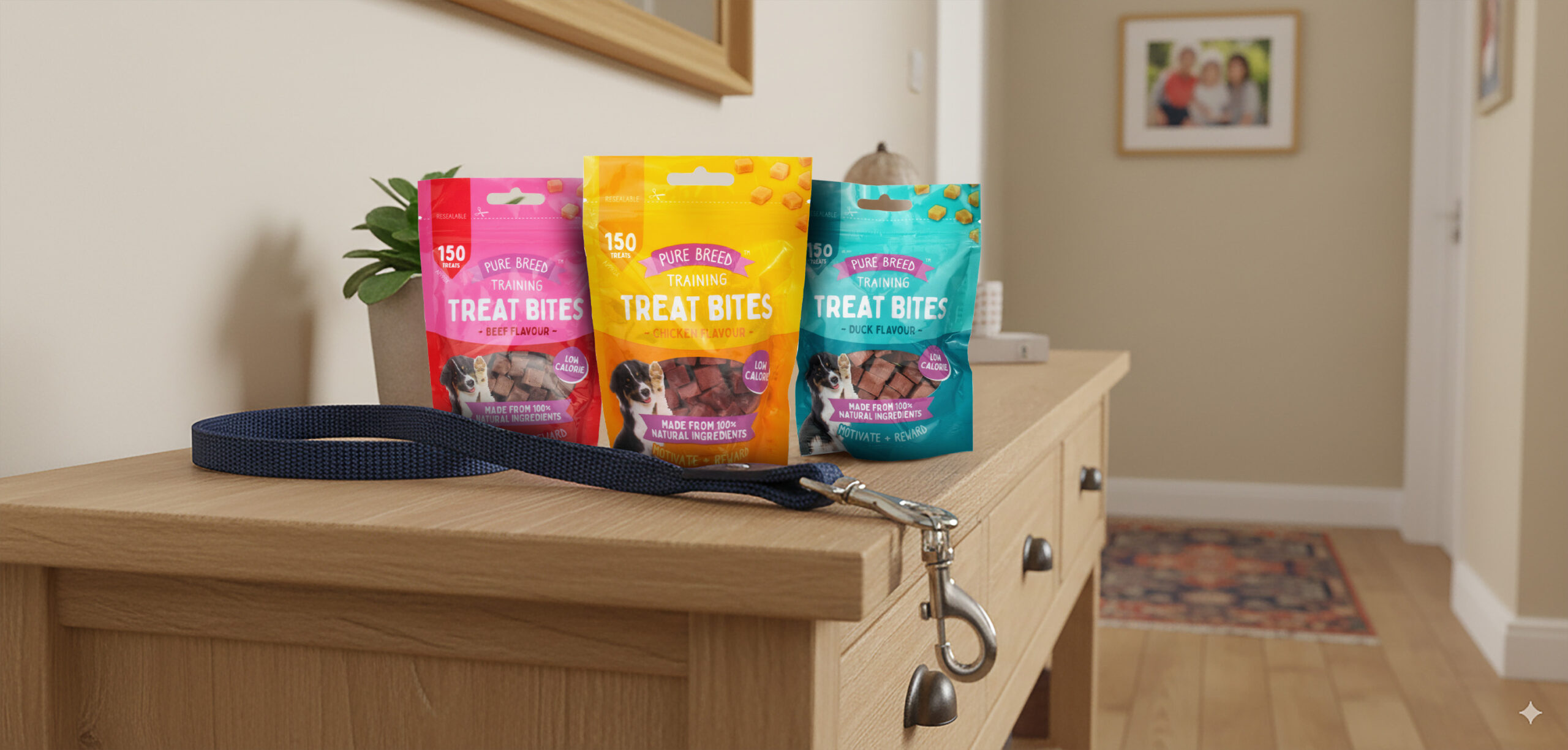
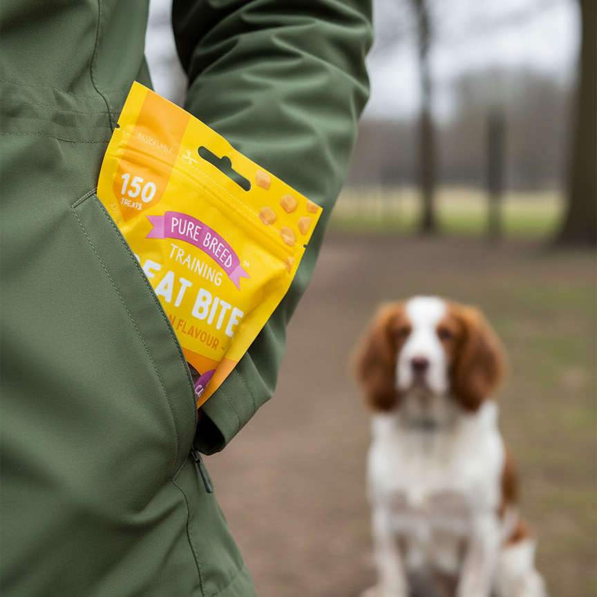
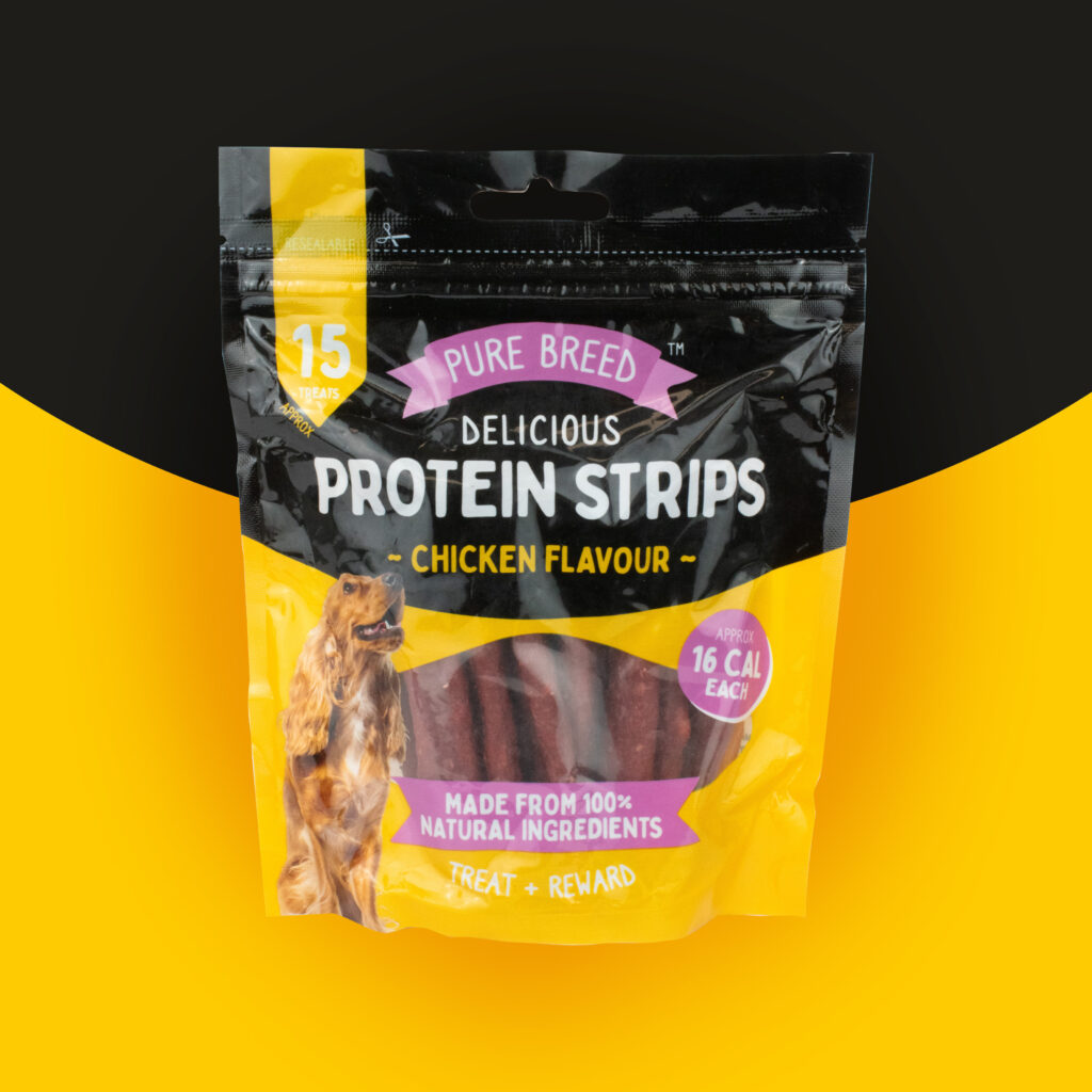
  • Working closely with the pet food buyer, I developed the visual identity and packaging system for the Pure Breed dog treat range. The goal was to create a cohesive brand look while making it simple for shoppers to distinguish between flavours and product types.

    Market research into competitor packaging and consumer preferences informed the direction, which led to the introduction of a consistent colour coded system – teal for duck, yellow for chicken, pink for beef, ensuring each flavour felt distinct while still part of a unified family.

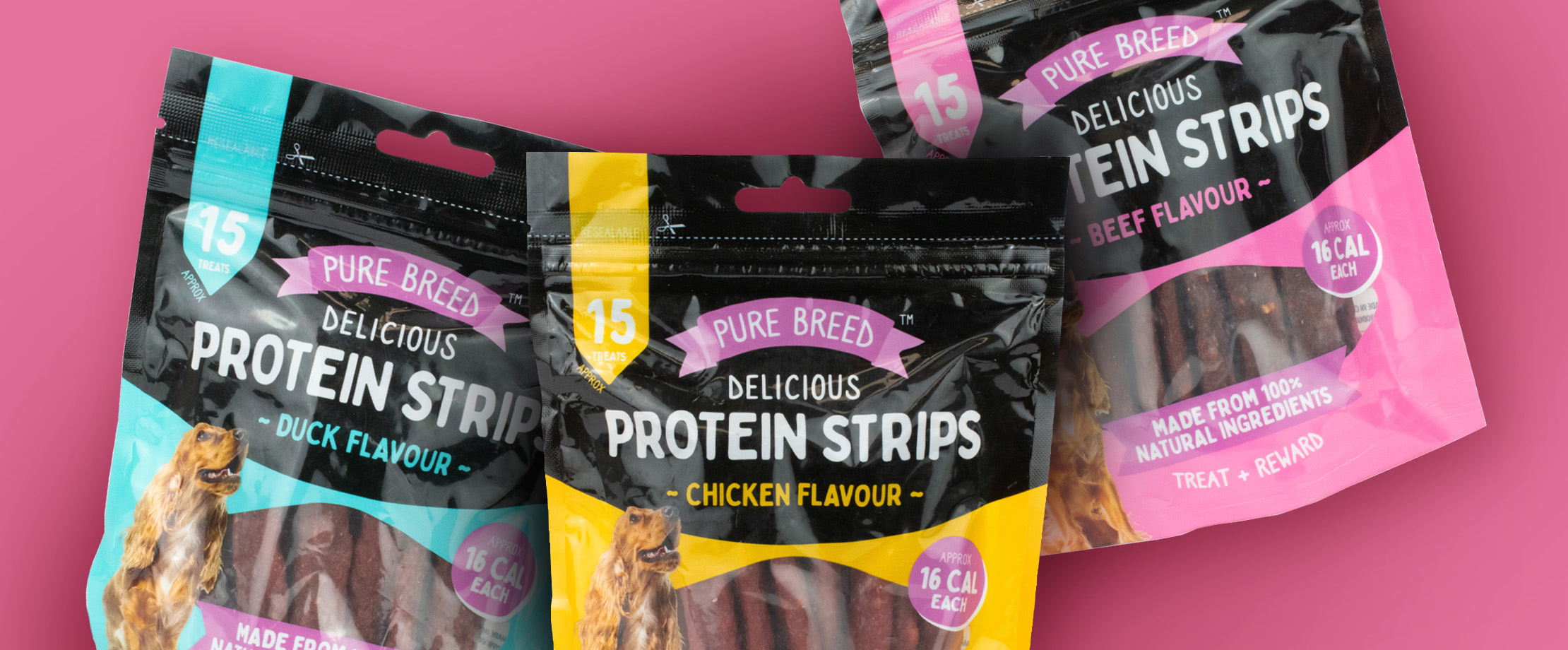
    When designing Protein Strips, I expanded the system by adding a bold black upper section, giving the packs a premium edge and differentiating them from the Training Treat Bites. Typography, colour, and imagery were carefully balanced to communicate quality and flavour while enhancing shelf impact.

    The final range delivered a refreshed, engaging look that improved brand presence, shopper clarity, and retail confidence. The Protein Strips launch in particular exceeded expectations, receiving excellent retailer feedback for its standout design.

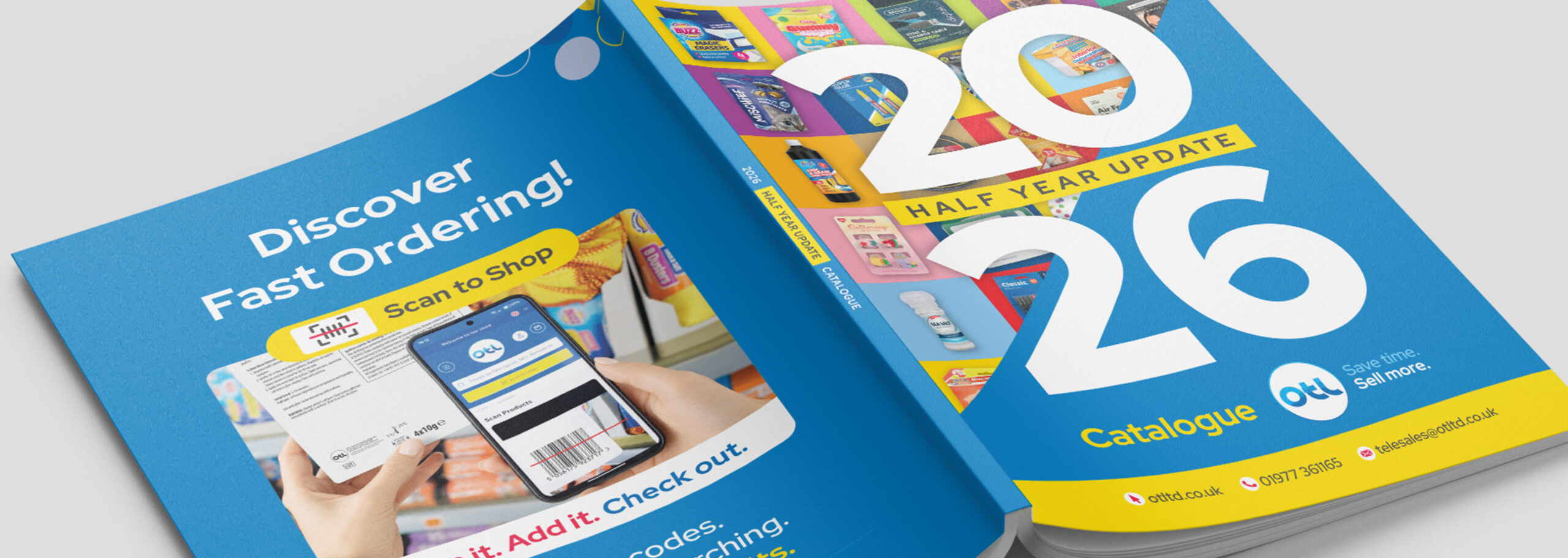
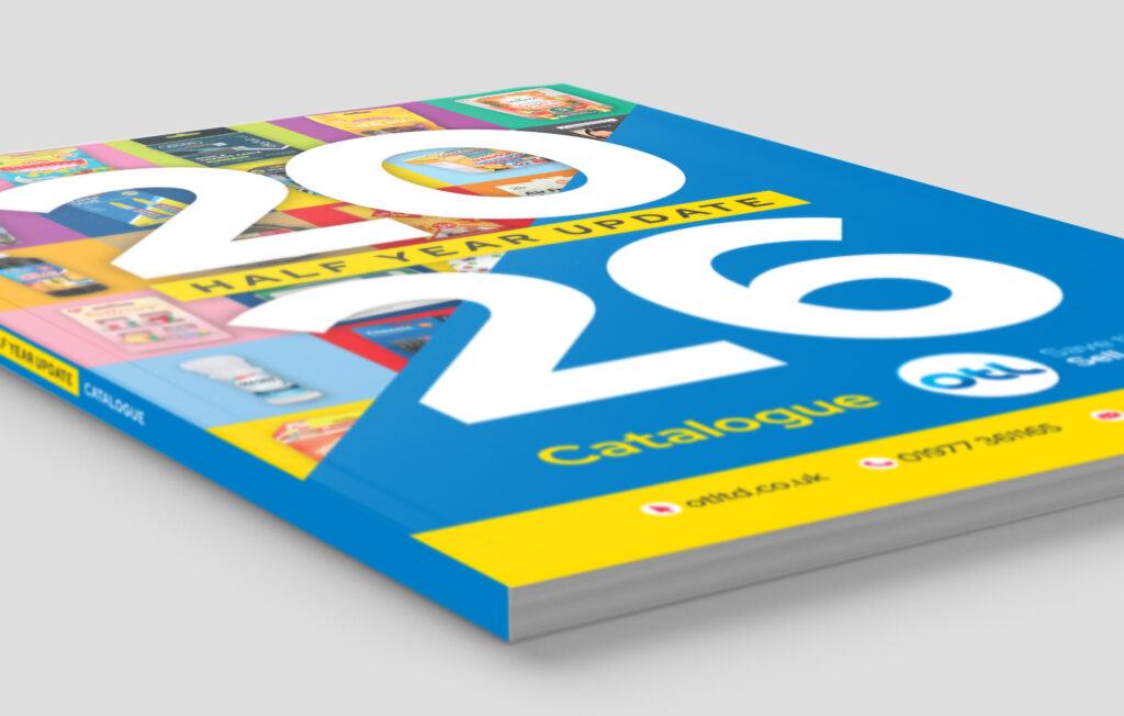
  • OTL’s. trade catalogue has gone through several refinements over the years to make it work harder for both trade customers and the sales team. A key part of that process has been identifying the information customers expect when ordering products and balancing that against the need to keep each page clear and easy to navigate.

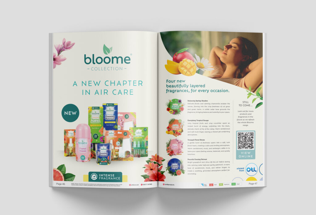
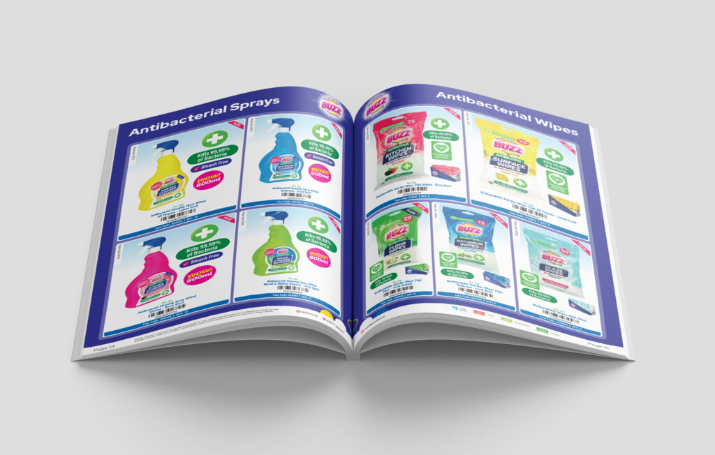
    Visually, the catalogue follows OTL’s brand guidelines, while still giving OTL’s core retail brands the opportunity to take centre stage through feature pages. Additional product callouts highlight key information alongside the main imagery, while shelf-ready display tray photography provides a useful reference for how products are presented in-store.

    To get to the final printed document, the process begins by establishing the running order and preparing the product data in Microsoft Excel. The catalogue is then generated in InDesign using the Data Merge feature, pulling in more than 12,000 individual data points to accurately place each product and its information across the pages.

    From there, each page is refined individually – adjusting product sizing to make the best use of the available space, adding relevant callouts, and introducing category-specific colourways and headings where required.

    The result is a catalogue that combines a consistent brand identity with practical detail that’s designed to make browsing, selling and ordering as straightforward as possible.


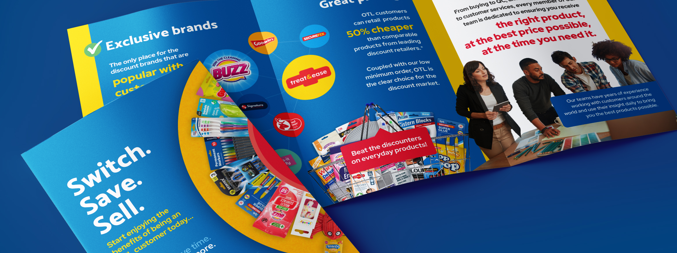
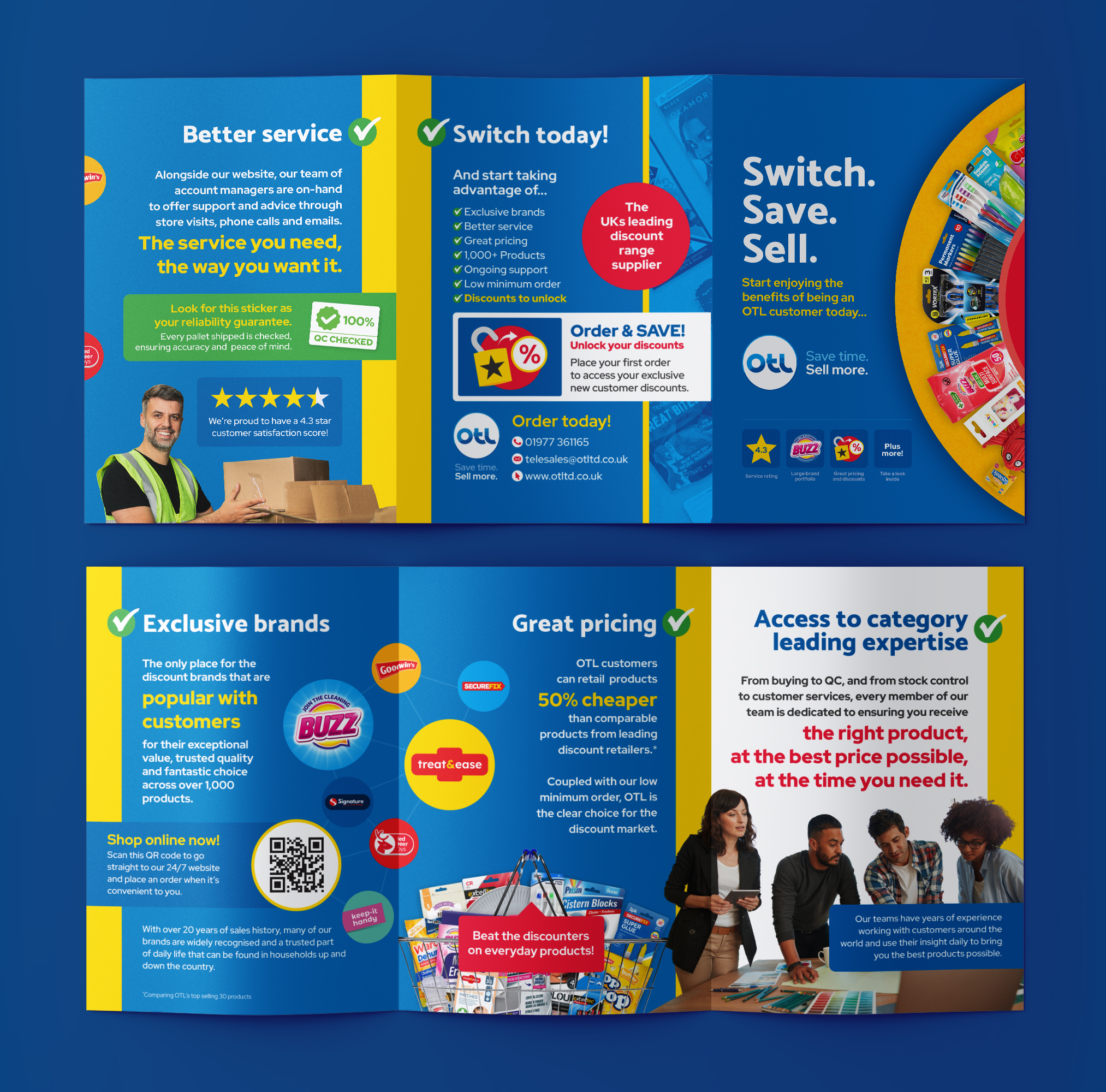
  • Building on previous brand work for OTL, I recognised that customers often had several suppliers to choose from, many offering a similar range of products at comparable prices. To set OTL apart, I positioned the flyer around its service proposition, highlighting the clear benefits customers could expect when choosing OTL. I created the headline “Switch. Save. Sell.” as both a bold introduction to the flyer’s message and a subtle nod to the company’s tagline “Save time. Sell more.”

    I then structured the content into four main sections, each supported with concise, benefit-led copy. Following the brand style guide, I incorporated approachable portrait photography to convey the passion and expertise of OTL’s employees – two of the company’s core values – and used the brand’s colour palette to create a clean, easy to navigate layout.