Develop a new brand identity and packaging design for a range of gummy sweets.

Overview
The first task was to refresh the logo design for the Keep-it Candy brand. The original logo lost clarity at smaller sizes, and its skewed layout made it difficult to adapt alongside future sub-brands.
To address this, I simplified the design and placed it on a subtle arc for better balance. A vibrant raspberry-red replaced the original red, giving the logo a fresher and fruitier feel. Finally, I introduced a more approachable, playful typeface to unify the updated look and strengthen the brand’s identity.

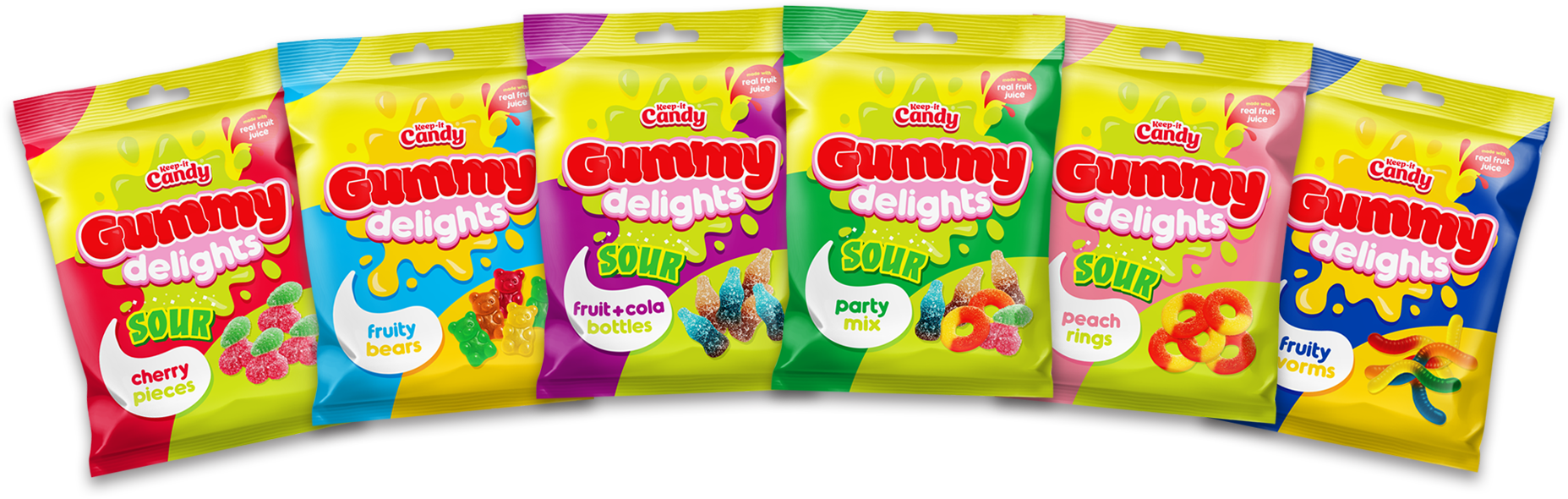
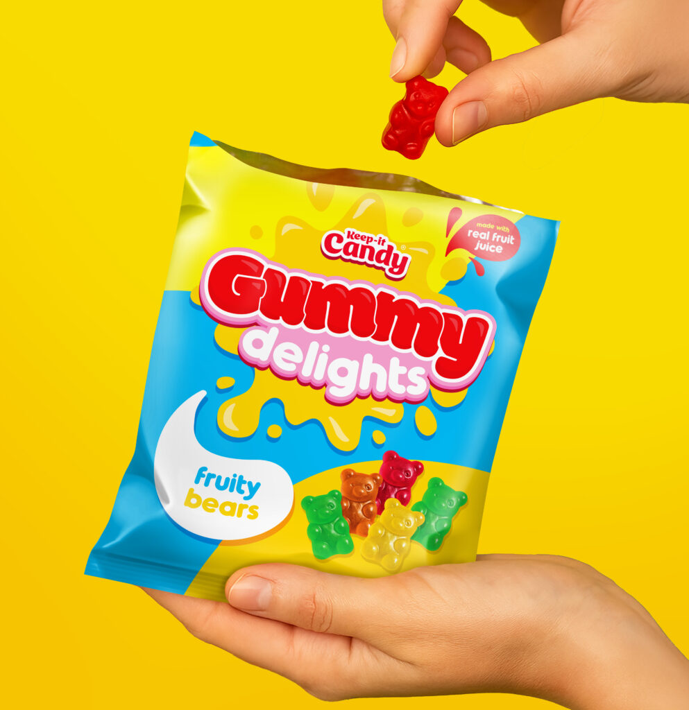
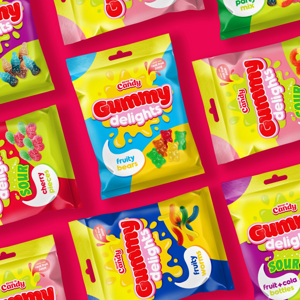
The next step was to create a design for the gummy range itself. Settling on “Gummy delights” I worked to develop a packaging style that brought clarity and strong shelf presence through bold use of colour, playful typography, and flavour cues.